
This unit is intended to encourage students to collect and visualize their own data relating to a persistent issue they identify in their community, which is referred to as a “wicked problem”. While this unit was designed for use in a Senior Project course at a North Philadelphia high school, it could also be adapted for Social Science, Mathematics, Seminar, or Visual Art classes at the Middle or High School level. Through this unit, students will be introduced to the concepts of “Big Data” and “Small Data”, exploring their implications on their lives. From there, students will be introduced to the artistic visualizations in Dear Data, and guided through a process of survey design, data collection, data visualization, and peer revision which will culminate in a mini-presentation of their work. Following this unit, it is recommended that educators guide students to work with data and/or visualizations that were gathered and/or created by media or research institutions. After completing this unit, students will develop a connection to data and an understanding of how data can be used to build empathetic understanding, rather than exclusively to label and judge
In her TED Talk “The Danger of a Single Story”, Chimamanda Adichie states, “Stories have been used to dispossess and to malign, but stories can also be used to empower and to humanize. Stories can break the dignity of a people, but stories can also repair that broken dignity.” Increasingly, data is playing the same role stories have played, particularly when this data is used to describe oppressed communities. In examining the crucial issues of education and incarceration, data is being used to condemn communities and individuals. Even though this data can have serious implications on their lives, it can feel distant for the students we serve. By requiring students to gather their own sets of data and to artistically visualize them, this unit is designed to give students both a sense of control over and an understanding of data collection and visualization. This unit was created to be used as a part of Senior Project at The U School, an “Innovation Network” school in the School District of Philadelphia. We are nonselective, with about half of our students coming from our broadly defined neighborhood (including Kensington and North Philadelphia) and half from the rest of the city (mainly South and West Philadelphia). We serve just under 300 students, with 80% of our students identifying as African-American, 13% as Latinx, 4% as White, and 1% as Asian. All of our students receive free or reduced-price lunch, and 28% of our students receive Special Education services. Our Senior Project curriculum, which began in the 2017-18 school year, builds on the work students have done in Humanities over the course of their time at The U School. While exploring English and History, students have created portfolios of Narrative, Argumentative, and Informational writing inspired by World, American, and AfricanAmerican History. For Senior Project, students are asked to identify a persistent issue that they see in their lives or communities, which we term “wicked problems” (see Background). After researching their topic and engaging with the community, students create Narrative, Argumentative, and Informational pieces that combine to form their portfolio, which inspires a final presentation in front of their 12th grade peers and community members. In Humanities and the first iteration of Senior Project, we’ve found the most success having students write Narratives and Argumentative pieces, while Informational work has been more of a struggle. We have had some success having students design infographics, but their use of data has generally been an afterthought or a distraction from their work. Our students are most invested in the stories of individual people, and we have had considerable success building empathy in our students’ approaches to Humanities. Getting them interested in contextual information, often derived from statistics, has been more of a challenge. Through a focus on “small” and “thick” data (see Background), students will understand that data can also be human and relatable in scale, and that they can also manipulate data, not simply be manipulated by it. The emphasis on data visualization is intended to help students create their own visualizations of their collected data in order to enable viewers to better understand the human toll of the wicked problem they have identified. Through this project, students will be exposed to all aspects of data literacy, described by School Library Journal as “the ability to understand, generate, and use data” (Spina). By undertaking the process of collecting survey data, organizing it, and creating their own visualizations, students will better understand the process of data creation which will help them connect to and analyze data that feels more distant.
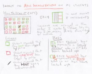
While this curriculum unit is designed for use in a Senior Project curriculum, it could be adapted for use in other Math, History, English, Art, or Seminar courses. After describing how we use wicked problems to ground our Senior Project, I will move on to discuss how I conceptualize data as a part of this project and then walk through an example of what students will produce at the end of this curriculum unit. Humanities at The U School Our school operates on a competency-based model, which means that we use the Common Core standards as the basis for our grading. This also means that students are not graded for “Practice” activities, but only graded for “Mastery” tasks. Each unit culminates with a “Performance Task”, or project, where students are asked to show what they learned in a particular unit of study in an authentic way. In the Humanities classroom, we combine English and History competencies for a two-credit course. Our end of unit Performance Tasks are primarily graded on English writing competencies, either of the Narrative, Argumentative, or Informational variety. In grades 9-11, students create 2-3 of each of these types of writing for their portfolios to complete the course. Our Argumentative and Narrative units have been the most accessible to students, focusing on mythology, monologues, poetry, argumentative letters, or mock trials and debates. For the past three years, our most successful Informational units have been based around infographics. We have done infographic projects on revolutions (World History), the US Presidential election (American History), and traditions of expression in African cultures (African-American History). We have been successful in these units in teaching students how to use informational text structures to visually organize their information in an effective way. However, we have been less successful in getting students to thoughtfully visualize and contextualize data as it relates to their topic – a key component of a successful infographic. While we are not teaching a math course or grading students on math competencies, visualizing and contextualizing data is an important component of any quality history or nonfiction Informational text. When we evaluate students on Informational writing, one competency we use is: “How well do I use precise language, vocabulary, and techniques?” (ELA 4.4). In the description of level 12 work for this competency, it states, “I can provide the most significant information about my topic that is relevant to my audience, while integrating charts, graphs, images, headings, etc. effectively.” This is a central component of effective Informational writing, but one that we have not taught or assessed particularly well over the past three years. By incorporating data visualization in Senior Project, students will create their own data that can be effectively incorporated into their projects and later find additional data from academic and government sources that they can also incorporate. Senior Project at The U School Senior Project, while a graduation requirement across the School District of Philadelphia, varies widely depending on the school. In every context, research, writing, service, and presentation are required components. At The U School, our Senior Project is focused on encouraging students to develop a complex understanding of wicked problems they have identified in their communities. Wicked Problems “Wicked Problem” is a term from social engineering that has been central to the work of The U School since its founding in 2014. Rittel and Webber (1973) defined “wicked problems”, stating: As you will see, we are calling them “wicked” not because these properties are themselves ethically deplorable. We use the term “wicked” in a meaning akin to that of “malignant” (in contrast to “benign”) or “vicious” (like a circle) or “tricky” (like a leprechaun) or “aggressive” (like a lion, in contrast to the docility of a lamb). We do not mean to personify these properties of social systems by implying malicious intent (160-161). In defining “wicked problems” for our students as they started Senior Project this year, we wrote, “A problem that is difficult or impossible to solve based on how complex and contradictory it is. These are problems that have existed for many years, which one would not be able to effectively solve ‘overnight’.” Attending under resourced schools in Philadelphia, and living in some of its most oppressed communities, our students face many of these types of issues on a daily basis. In the chart below you will find some ideas we gave students as they began their projects. – Food & Diet – Exercise & Sports – Barriers to learning – Standardized testing – Conditions of school buildings – Gender & Sexism – Sexual Orientation & Homophobia – Class & Classism – Gentrification – Natural disasters – Social media & the Internet (including net neutrality) – American political system Reflecting on Senior Project 2017-18 During the 2017-18 school year, The U School embarked on its first Senior Project. At the beginning of the process, students were asked to identify a wicked problem that they would explore throughout the course of the project. From there, students were asked to research their topic, finding information from news, encyclopedia, and academic/government research sources. Students then created three different types of pieces using their information: Informational News Articles, open structure Narratives, and Argumentative Op-Eds. These three pieces, along with a Lab component that had students creating a piece of digital media, organizing a community event, or designing a piece of fashion, came together into a Senior Project portfolio. Students then gave an 8-10 minute presentation of their portfolio in front of their peers and panelists from the community, invited to our thematically arranged presentation days. In choosing wicked problems this year, most student projects were clustered around issues of health, education, mass incarceration, and gender & sexuality. Students chose topics that were deeply personal that impacted them, their close friends, or family members. In their portfolios and presentations, students reflected in deeply personal ways while expanding and deepening their understandings of their wicked problems. In general, the strongest components of students’ Senior Project were the narratives – sometimes personal and written in the first-person but most often written through a created character that served as a vehicle to tell a story that was either theirs or the story of someone close to them. In these pieces, students chose to create monologues, poetry, scripts, journal entries, and more straightforward short stories. The results were generally deeply personal and complex narratives. Looking Ahead to Senior Project 2018-2019 Generally, the Narrative components of student projects were the strongest and the Informational News Articles were the weakest. A few students had strong research skills and were able to clearly inform readers and viewers about their topic, integrating statistics and quotes from experts. However, from most students, this part of the portfolio was the least insightful and affecting. The strongest Informational pieces were created by students who centered the story of an individual they knew who was impacted by the issue in a personal way. One student who wrote about the impact of mass incarceration on the children of those incarcerated interviewed several of her friends who had incarcerated parents and seamlessly wove their stories together with data into a compelling News Article. By requiring students to collect their own data, create a visualization, and include an explanation of that visualization in their Informational piece, I am hoping that students will feel connected to their data in a way that they were connected to their Narratives this year. Turning Our Attention to Data Though students often struggle to understand data in context, we are creating data constantly. Most data that students are presented with in school is on a very large scale, and can feel distant, even if it is impacting our own lives. While this unit hopes to allow students to consider “big data”, the goal is to create smaller, more tangible data that helps to highlight the impact of their wicked problems on their own social networks. Big Data in Our Students’ Lives The vast majority of our students live their lives online and produce an incredible amount of data. Internet searches, social media posts, GPS-tracked locations, online payments, text messages. In some ways, looking at this data could give a picture of our lives. But in other ways, this data can be used to dehumanize us. As the volume of data we produce continues to increase exponentially, the implications of this data will only become more serious. Big data has made our lives more convenient in ways that we see each day as we browse the internet. For example, “In marketing, familiar uses of big data include ‘recommendation engines’ like those used by companies such as Netflix and Amazon to make purchase suggestions based on the prior interests of one customer as compared to millions of others” (Shaw). Big data has also helped to save lives through advances in public health. Along with the benefits, there are serious risks related to big data. The primary risk relates to the restriction of our future potential based on our past actions. As data scientist Kenneth Cukier says, “Privacy was the central challenge in a small data era. In the big data age, the challenge will be safeguarding free will, moral choice, human volition, human agency” (“Big data is better data”). In another article, Cukier brings up school records and educational technology as an example of this. He says that the primary challenge of the increasing use of technology in education is not violations of privacy, but rather “that it shackles us to our past, denying us due credit for our ability to evolve, grow, and change” (“How big data will haunt you forever…”). In her TED Talk, data scientist Cathy O’Neil brings up another way that big data can be used to restrict the choices of individual, especially those from marginalized communities: policing and incarceration. In addition to mentioning “hot spot policing”, which encourages departments to predict where future crimes will occur based on where past crimes have occurred, she mentions the “recidivism risk” algorithms used by judges in sentencing. In her example, a Black man brought in for drug possession with a record but no felonies received a 10 out of 10 risk score, while a White man brought in for the same crime with a felony on his record received a 3 out of 10 risk score (“The era of blind faith in big data must end”). This data is used to give the Black man a longer sentence, replicating and maybe even deepening the inequality that already exists in our criminal justice system. There are potential solutions to these pitfalls. Technology ethnographer Tricia Wang recommends what she calls “thick data” to be used in conjunction with big data. She says, “Big data is able to offer insights at scale and leverage the best of machine intelligence, whereas thick data can help us rescue the context loss that comes from making big data usable, and leverage the best of human intelligence” (“The human insights missing from big data”). By having students create their own data through their networks, the hope is that this data will be “thick”, while also being quantitative. In leading with the creation of visualizations from their own data, hopefully students will be better able to comprehend data from sources as they continue their research. As well, students will have data that feels human and relatable rather than decontextualized and impersonal. Humanizing Data through Artistic Visualizations The inspiration for this particular data visualization project comes from Dear Data by Giorgia Lupi and Stefanie Posavec. Each week over the course of a year, these two data designers became friends by collecting data about their own lives and creating postcards visualizing the data they collected. They sent these postcards to each other, as they lived in New York and London respectively. On the front of each card, they included the handdrawn visualization of the data, while on the back they included a detailed key to help the other understand their data. Lupi and Posavec acknowledge the data that we create each day, and view their “slow data” project as a way to push back against the ways in which data can sometimes be dehumanizing. They write, “Instead of using data just to become more efficient, we argue we can use data to become more humane and to connect with ourselves and others at a deeper level” (Lupi & Posavec xi). Through this project, I am hoping to bring this spirit to students’ wicked problem data. Their weekly data ranged from tracking the amount of times they looked at clocks to tracking their physical contact with others or the amount of times they gave or received compliments. In the 2017-18 school year, my colleague at The U School, Highlight Digital Media Lab teacher Joshua Kleiman, used the work of Lupi and Posavec in his classroom and had his students collect data about their own lives in a similar fashion, putting the resulting visualizations on t-shirts for the students to wear. In Kleiman’s case, this data was individual, from students tracking their dance moves to students tracking their conversations with a boyfriend to students tracking their video game play (see Figure 1 for an example of a student tracking laughter). As he worked through this project with students, he used examples from Dear Data to help spur their own creative and original work. To help students break down this massive project and be able to apply it as a mentor text for their own work, Joshua divided the visualizations of Lupi and Posavec into three structures that helped organize their work: Category-based, Time-based, or Instance-based. Kleiman provided examples for students of each type of structure from Dear Data. Looking to engage his audience of high schoolers, he chose Posavec’s “Week of Swearing” (Dear Data 201) as his Category-based organization. In this particular example, Posavec organizes her piece by the curse word she said, using colors to illustrate how the swear was used, who it was in front of, and what it was related to. For his Time-based example, Joshua used Posavec’s “Week of Emotions” (Dear Data 61). In this example, she organized her emotions by time of day and by day of the week, using color coding to record the type of emotion. Lupi’s “Week of Emotions” visualization uses a Category-based organization, providing for an interesting comparison for how similar data can be illustrated in a different organizational structure. Lupi’s “A Week of New People” (Dear Data 218) was used as the example for Instance-based. For this visualization, she organized the new people she met over the course of the week in chronological order, with each person having its own box. She used symbols, colors, and shapes to represent the gender of the person, whether they had met before, who introduced them, and other characteristics. The majority students who this unit is planned for already completed this visualization project with Kleiman, so this will be used as a jumping off point for our work together. Bringing Data Visualization to Senior Project With students tackling issues from mass incarceration to addiction to the dropout crisis in schools, finding data is not much of a challenge. However, as we saw this year, the challenge is for students to incorporate data in a meaningful way into their deeply personal projects. I see this project as a way to “bridge the gap” between the type of incarceration data (1 in 3 Black men will go to prison in their lifetimes) that can deepen student projects and how impersonal that data can feel. By having students collect their own data and using the type of slow data visualization described in Dear Data, we will allow students to make connections between quantitative data that can often feel abstract and qualitative data about human experiences that often feels more relatable. Creating Our Own Data Visualizations A large number of steps are necessary for students to create their own visualizations for their senior project. Rather than simply list the abstract steps, I will explain each step by describing a sample visualization. The process is informed by my colleague Kleiman’s work and Dear Data and listed in each topic heading. While Kleiman’s work with his students involved mainly observational data about their own lives, I knew this wouldn’t work for all of the wicked problems my students selected for their Senior Projects. Instead, I decided to use his project and Dear Data as a model to create a project where students would use surveys to create similarly artistic and personal visualizations. This project is not intended to have students generate random or representative samples. Rather, the goal is for students to choose a population and survey 20-30 individuals within that population, using close-ended questions. Using the results and inspiration from Dear Data, students will create their own hand-drawn visualizations, which will then be incorporated in their Informational News Articles and Senior Project Presentations. Choosing a Population & Generating Close-Ended Survey Questions With inspiration from this year’s powerful Senior Project presentations on mass incarceration, I decided to focus my data collection on the impact of mass incarceration on students within my school. I knew that I wanted to capture its impact on my students and their families. Understanding that students will be collecting data on sensitive topics, it is important to give them guidelines to use when asking sensitive questions to others. They should always make it clear to the respondent that they don’t have to answer and that the data is being collected in a way that is anonymous. Finally, as they are thinking about the questions, they should consider the least invasive way to ask the question. As I surveyed my students, I kept those three ideas in consideration, and asked students for general feelings and numbers rather than asking for specific names and relationships. The first three questions were clear from the beginning: ● How many of your family members are or have been locked up? (Numerical response) ● How many of your friends are or have been locked up? (Numerical response) ● Have you ever been locked up? (Yes or No) I elected to phrase the question as “locked up” rather than “incarcerated” because I knew this would generate a more accurate response from students. Some students immediately responded with an exact number, while others guesstimated the number in each category. Since I did not yet know what my visualization would look like, I also wanted to expand a few other types of questions about different topics that I see as adjacent to mass incarceration. I knew from previous classroom projects that many of my students had many experiences with (and feelings about) law enforcement. For that reason, I decided to add the questions: ● Have you ever been stopped by the police? (Yes or No; I allowed students to include times when their parents were stopped while they were present.) ● On a scale of 1 (strongly disagree) to 5 (strongly agree), rate your response to the statement: Police help keep my community safe. With those questions in mind, I set out to briefly survey 30 students in various grades at my school. While much of this data could have been collected digitally, the idea of “humanizing data” made it important to collect this data through face-to-face conversations rather than digitally. I will also be requiring students to collect their data face-to-face. Creating Tools for Data Collection At the recommendation of Kleiman, I used two different data collection tools: a real-time tool that would always be available to me and an online tool to scrub my data after the fact. I found both tools to be helpful in a different way, and will require students to use and create both. For real-time collection, I used the Notes app on my phone. While I will allow students to use a paper-based tool for this process, students will be encouraged to use tools that work for them. I know that I have a hard time keeping track of paper versions of things, so I opted for the digital tool. Since I had my questions and their order memorized, I was able to record my data without additional words (Figure 2). I began each entry by skipping a line and putting the initials of the student. I then asked what gender they identified as and recorded M (Male), F (Female), or N (Non-Binary). Then, I asked students the five questions listed above in that order, recording the numerical or Y (Yes) / N (No) answers. Several students continued the conversation beyond the initial survey, which led me to conclude that I To scrub my data, I used a Google Sheet, creating a row for each student’s responses (Figure 3). I set up data validation dropdowns for most questions, which Kleiman informed me was a great way of keeping students engaged in the process of inputting data into their sheets. Cleaning up the data made it more clear and accessible to me as I moved into the process of creating my visualization. See below for an example of the first few rows of my scrubbed data spreadsheet. From Data to Visualization Once I had collected all data from students, I began to consider my visualization. I knew that I wanted to organize my visualization by Instance, rather than by Time or Group. I wanted to emphasize the amount of people in students’ lives that had experienced incarceration, emphasizing my first 3 questions. When I started this visualization, I had not yet determined how (or if) I would use questions 4 and 5. I also knew that I wanted to incorporate the visual language of incarceration in my visualization, so I decided to use bars as the primary shape in my design, and gray and orange as the primary colors. My first sketch (Figure 4) was based on the idea of using lines, almost like a bar graph, to represent the impact of incarceration on individual students. I quickly realized that this would not adequately sum up my data because it would be too difficult to differentiate between students, the category of person incarcerated, and to include all students in the line. I moved on and used Lupi’s “A Week of Doors” example from Dear Data to help me consider how I could more efficiently organize my data. In that example, she visualizes each door she entered during that week as an individual instance. Within each instance, she used colors, shapes, and patterns to illustrate the different characteristics of each door. I realized that I could apply a similar design to my work with individual students’ experiences of incarceration. In my first example, I did a gray outline, with a green line in the middle (to represent that the student HAD been stopped by the police) and 3 vertical gray lines (to represent that the student had 3 family members who are or have been locked up) and 7 horizontal orange line (to represent that the student had 7 friends who are or have been locked up). In my initial sketch (Figure 5, first box), I was happy with most of the aspects of the design, but realized that the “Yes” or “No” answer to whether students had been stopped by the police could be better represented through a border, rather than a center line. I tried that twice (Figure 5, second and third boxes) and then got feedback from Kleiman, who said the design looked great and made sense. From there, I began to make my final visualization. I used a ruler and measured out spaces for boxes on a blank piece of paper, with each square being 2 cm by 2 cm with a 1 cm between. I drew a grid in order to facilitate the process of creating each individual square (Figure 6). From there, I used a ruler and colored pencils to create each individual box (Figure 7). I had my scrubbed data spreadsheet open and highlighted each row (student) once I had created that box, to make sure that there would not be duplicates (Figure 8). Once I created each box, I used an eraser to get rid of the grid lines. Though my final paper version was crumpled and a bit messy (Figure 9), I used a scanner to create a digitized version, and Adobe Illustrator to clean up the grid and eliminate any stray marks. See below for my finished version of the visualization. Creating a Key Using inspiration from the model of Dear Data, I created a Key (or: “How to Read It”) for my visualization. As the samples do, I started with an overview of what each individual shape represents and the overall organization of the piece. Then, I divided the rest of the key into two sections, specifying what each line and color represented on the visualization. I divided this section into the meaning of the “Borders” and the meaning of the “Bars”. The key used color to emphasize key points. Similar to the visualizations in Dear Data, my finished visualization is visually appealing but incomprehensible without the key. However, after looking at the key, the data presented paints a picture of the drastic impact of incarceration on the students I teach. Analyzing Data Visualizations Whether on standardized tests or in classroom activities, it can be difficult for students to engage with data, especially when it feels abstract and decontextualized. Kleiman noticed the same struggle with his students when he began to talk about data visualization, but then was able to engage students more deeply in the process after they had collected and visualized (by hand) their own data. After students complete this process, we will move into analysis of data from government and academic sources, which students will also need to include in their News Articles and Presentations.
Health & Wellness
Education
Identity
Environment
Public Policy
– Medical issues (including Cancer, HIV/AIDS, STDs, addiction, mental illness, high blood pressure, diabetes)
– School funding
– Race & Racism
– Climate change
– Jails, Prisons, and Mass Incarceration
should encourage students to return to some of the individuals they survey for longer interviews later in their projects.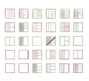
This unit is created for use with 12th grade students as one component of a multi-part Senior Project, which is grounded in our Humanities course. This unit is intended to work with students on the informational component of their senior project, with the specific intention of helping students to incorporate data visualizations to help readers comprehend their news articles based on their wicked problems. The main objectives for this unit include: ● Define “Big Data” and “Small Data”. ● Use data visualization to contextualize their wicked problem. ● Understand the process of moving from survey questions to data collection to a data visualization. ● Create their own data visualizations, using original data they collected. ● Incorporate their own original data visualization into their News Article, providing an explanation to deepen the reader’s understanding. ● Develop an understanding of the significance of data visualization as used in news sources. ● Present their own analysis of data, both in writing and orally. ● Give feedback to peers on their explanations and presentations.
Strategies This unit is designed so that students can complete in an asynchronous manner – with students not having to wait for other students before moving to the next activity. While there will be some whole class activities, most of this work will be designed in order for students to access independently. I do not emphasize whole class direct instruction or an “I Do, We Do, You Do” structure in my classroom. Most strategies implemented in this unit are designed for self-driven work. Mini-Lesson This is the primary structure of instruction in this unit. A small group of students (5-10) from the class will be convened for a 10-15 minute lesson that focuses on skills or content that are necessary to complete the current unit of study. These should be scheduled in advance, and should occur several times for each skill during a unit. If students can demonstrate grade-level mastery of a skill or content before a Mini-Lesson, they are generally not required to attend. Check-In If implemented in a self-driven manner, students will be at different stages of this unit within the same classroom on the same day. This makes it imperative to check-in with each student each day. It is helpful to prepare to leverage these approximately 30 second check-ins by being able to quickly record in a tracker what portion of the assignment the student is on, and by being able to quickly prompt that student based on their progress. Recommendations for prompting are listed with each Classroom Activity below. Voice & Choice This unit is grounded in the belief that we need to give students voice and choice when it comes to their learning. This applies to both what they are learning about as well as what they are creating. While this does make managing projects more challenging from a teacher’s perspective, it also makes it more engaging from a student perspective. Through Assignment Numbering for Project Management With voice and choice as key components of the unit, it is essential for an educator to focus on project management. As a starting point, it is helpful to number each stage in the unit. Generally, the unit number will precede the activity number. For example, the 5th assignment in Unit 7 would be 7.05. This allows for easy tracking of student progress through a project in a spreadsheet. Using Mentor Texts When students are working to create authentic performance tasks, it is important that they can see mentor texts to inspire their own work. Generally, this concept is applied to writing, specifically narrative and argumentative pieces. This concept also applies to data visualizations and other visual work, such as infographics. A variety of examples can help students create pieces that reflect their own topic, interests, and style. Throughout this unit, students will see a variety of data visualization examples, from the abstract and artistic work in Dear Data to the concrete news work from The New York Times. Peer Revision It is productive to encourage students to give feedback on the work of their classmates at multiple stages in the design process. Not only does this provide students with advice for how to reiterate and improve their own work, but it also allows students to see additional examples that can inspire their own work. While products differ throughout the year, it is helpful to have a protocol for peer revision that is consistent, which will encourage it to become a habit for students. Frayer Model Vocabulary Squares When defining key terms with students, it can be helpful to use Frayer Model vocabulary squares. While this model can be adapted for different types of terms and contexts, it generally has four central squares and one square at the bottom. In the upper right square, students define the term. In one of the squares, students should draw an illustration that helps them remember the meaning of the term. In the other squares, students can identify examples and non-examples or synonyms and antonyms. In the square at the bottom, students should use the term in a sentence. Barometer While many of these strategies are less geared towards whole class direct instruction, Barometer is best for that format. It will be used in an introductory lesson that gets Classroom Presentations Students should be given the opportunity to share their work in front of peers and others, both in the classroom and beyond. At the end of Senior Project, students will do a presentation in front of a panel of community members and all of their 12th grade peers. A small-scale classroom presentation earlier in the year at the end of this project is a helpful scaffold to move students towards quality presentations when it comes to the high-stakes moment. This also provides another opportunity for students to be inspired and motivated by the work of their peers. It is helpful to have students fill out a simple feedback form while each of their peers presents that will be given to that classmate after presentations. This form has a place for compliments and questions, and asks students to grade their peers on one of the multiple competencies that will be used to evaluate their presentations. U School Design Process This unit follows The U School design process (See Figure 10), which is used to guide educator planning and student learning. From a teacher perspective, this is similar to the concept of the constructivist 5E instructional model extended over an entire unit of study. “Wicked Problems” are normally the starting point for this process. Students are first asked to explore the topic in the DISCOVER stage, beginning with their own prior knowledge. Then, the class will go through a DEFINE stage where they learn concrete information about their topic and begin to gather thoughts and research. From there, students move on to the DESIGN phase where they begin to draft their final Performance Task project. Then, students get feedback and reiterate their work in the DEVELOP stage. Finally, students submit their final work, present it, and reflect on the process during the DELIVER stage. Depending on the scale of the project, this process can occur over the scope of a week, a month, or even a semester.
the artistic expression inspired by Dear Data and their self-selected Wicked Problems, there is a considerable amount of Voice & Choice in this unit.
students thinking about the data we generate on a daily basis and their own personal comfort with analyzing data. In this activity, “Strongly Agree” and “Strongly Disagree” are posted on the wall on opposite ends of the classroom. Desks and chairs are moved aside, and students are asked to stand in the center of the room. Students are then given a statement (“I share personal information about myself online.”) and asked to move to the place on the line where they fall. Then, students are asked to have a quick discussion with 3-4 students standing near them, and then students from each section of the line are asked to share their thoughts. The educator will then share another prompt and have students rearrange based on their opinions.
This unit is a part of students’ Senior Projects at The U School. Before beginning these activities, students will have identified a wicked problem in their communities, written a proposal outlining their vision, and crafted a narrative that shows characters (real or fictional) wrestling with the wicked problem. While this unit could be done on its own, it is worth a brief discussion of wicked problems that align with students’ interests and experiences and an identification of problems students would like to pursue before diving into this work. Culminating assignments of this unit could be completed individually or in small groups. The structure of this unit follows The U School design process (see Strategies above) and is numbered in order to better facilitate educator project management. Throughout the course of this unit, students will explore the Essential Question: How might data visualization be used to build an empathetic understanding of how wicked problems impact individuals? What is “Big Data” and how does it relate to my life? What is “Small Data” and how can it help overcome some of the challenges of “Big Data”? Through this lesson, students will define “Big Data” and “Small Data” by reading excerpts about each and creating a Frayer Model for each term. For “Big Data”, students will read an excerpt from “The Complete Beginner’s Guide to Big Data in 2017” by Bernard Marr published on Forbes.com. In order to define “Small Data”, students should read an excerpt from (or the entirety of) the introduction to Dear Data. To engage students in this lesson, give them a provocative example of how this “Big Data” could be used to impact their lives, in a way that is positive, negative, or ideally both. For my students, the best way to engage students in this conversation is through policing. Two videos, “Information Technology is helping police predict where and when criminal activity is likely to occur” and “How Big Data Can Be Used to Predict and Solve Crime”, could be used to start this conversation. After the class has watched the video collectively, educator should engage the class in a Barometer activity around the themes of the video. Students will move to a side of the room, depending on whether they agree, disagree, or fall somewhere in the middle on each statement. Some recommended prompts could include: Educator will support students in completing the Frayer model for each word. Students may complete this on their own, but also the educator can support them as they need that support. What makes a data visualization useful? Students will analyze visualizations from Dear Data. Initially, students should be asked to answer the questions below as they look at the Dear Data visualizations (inspired by “What’s Going on in this Graph?” from the New York Times). The first 3 questions should be answered by students before they look at the key for the visualization: For these visualizations, I recommend using those that will model for students each of the 3 types of organizational structure from Dear Data (described in Background). You can use any from the book, but the visualizations below work the best: To begin this lesson, students will explore the most recent graph from New York Times’ “What’s Going on in this Graph?” As students explore the graph, they will answer the questions (from the New York Times Learning Network): Students will then post their thoughts on the New York Times Learning Network, or respond to the postings of students from across the country. The following week, an explanation of the graph is posted and students will be asked to revisit this activity. In a class discussion, students will share what they noticed, wondered, and their claims about what might be going on in the graph. As a class, we will pull together our collective thoughts. Using the graph from the Hook, transition students into a conversation and notes about what makes a data visualization useful. In this mini-lesson, it is helpful to focus on the use of design elements (color, shape, size, line) as well as the overall organization of the piece. They can also focus on labels and keys that are incorporated. Another mini-lesson could focus on the sample Dear Data visualizations, going through the same process and discussion using the “What’s Going on in this Graph?” piece from the Hook. It is helpful to look at design elements and the overall organization of the piece. I would recommend looking at the graph without the key first, and looking back at the key and noticing how that changes the interpretation of the graph. [Please view PDF attached above for Lessons 3-8 and Appendices]01 Discover: Big Data & Small Data
Guiding Questions
Task
Hook
Mini-Lesson
02 Discover: Visualizing Data
Guiding Questions
Task
Hook
Mini-Lesson
Informational Writing Research Informational Reading CCSS.ELA-LITERACY.RI.11-12.1 – Cite strong and thorough textual evidence to support analysis of what the text says explicitly as well as inferences drawn from the text, including determining where the text leaves matters uncertain.
Adichie, Chimamanda Ngozi. “The Danger of a Single Story.” TED: Ideas Worth Spreading, 16 Oct. 2009, www.ted.com/talks/chimamanda_adichie_the_danger_of_a_single_story?language=en. “Competency Education Toolkit.” Google Sites, Office of New School Models, 2014, http://sites.google.com/a/philasd.org/competencyeducation/home. Cukier, Kenneth. “Big Data Is Better Data.” TED: Ideas Worth Spreading, June 2014, www.ted.com/talks/kenneth_cukier_big_data_is_better_data. Gallagher, Kelly. “Making the Most of Mentor Texts.” Educational Leadership, vol. 71, no. 7, Apr. 2014, pp. 28–33, http://www.ascd.org/publications/educational-leadership/apr14/vol71/num07/Making-the-Most-of-Mentor-Texts.aspx. O’Neil, Cathy. “The Era of Blind Faith in Big Data Must End.” TED: Ideas Worth Spreading, Apr. 2017, www.ted.com/talks/cathy_o_neil_the_era_of_blind_faith_in_big_data_must_end/. Rittel, Horst W.J., and Melvin M. Webber. “Dilemmas in a General Theory of Planning.” Policy Sciences, vol. 4, 1973, pp. 155–169. Shaw, Jonathan. “Why ‘Big Data’ Is a Big Deal.” Harvard Magazine, 24 Aug. 2016, www.harvardmagazine.com/2014/03/why-big-data-is-a-big-deal. Spina, Carli. “Why Kids Need Data Literacy, and How You Can Teach It.” School Library Journal, 30 Jan. 2018, www.slj.com/2017/06/technology/why-kids-need-data-literacy-and-how-you-can-teach-it/. The Sentencing Project. “Regarding Racial Disparities in the United States Criminal Justice System.” Aug. 2013, http://sentencingproject.org/wp-content/uploads/2015/12/Race-and-Justice-Shadow-Report-ICCPR.pdf. Wang, Tricia. “The Human Insights Missing from Big Data.” TED: Ideas Worth Spreading, Sept. 2016, www.ted.com/talks/tricia_wang_the_human_insights_missing_from_big_data. BSCS 5E Instructional Model.” BSCS Science Learning, 2016, http://bscs.org/bscs-5e-instructional-model/. This is a helpful resource in implementing a constructivist learning model in your classroom, whether you teach a STEaM or Humanities subject. I have found this to be a more invigorating structure for lesson and unit planning than the 7-step Lesson Plan (“I do”, “We do”, “You do”) “How Big Data Can Be Used to Predict and Solve Crime.” Bloomberg, 24 June 2015, http://youtu.be/iTXNccnso3I. This video is intended to get students to understand one of the potential uses of “Big Data” that applies to their own lives. A policing example was chosen to provoke discussion and controversy with students. I can see my students having different opinions about the implications of this, and will use this video to start this discussion before a barometer activity. “Information Technology Is Helping Police Predict Where and When Criminal Activity Is Likely to Occur.” AP News 31 July 2015, http://youtu.be/ho10naUH5ME. This is an alternate example that could be used to engage students in a conversation about the applications of “Big Data” on policing. Lupi, Giorgia, and Stefanie Posavec. Dear Data. Princeton Architectural Press, 2016. This is the primary mentor text used in this unit. The book is a helpful resource because it has all of the weeks of the Dear Data project printed in order, and it is an impressive and beautiful publication. It could be especially engaging for students to have a physical copy of this book for reference. There is also a useful introduction, which could be helpful in orienting students to the project. An excerpt from this book should be used to help students define “Small Data”. Lupi, Giorgia, and Stefanie Posavec. “DEAR DATA: By Week.” Dear Data, http://www.dear-data.com/by-week. If you are not planning to purchase the book, you can find all 52 weeks and detailed descriptions of their process on their website. This would be helpful for a classroom with laptops or tablets so that students can have the freedom to explore the weeks that most appeal to them. It could also be a helpful addition when talking about process with students to show them the drafts that Lupi & Posavec created before their final versions. I always find it to be helpful to have models of the revision process for students. Marr, Bernard. “The Complete Beginner’s Guide To Big Data In 2017.” Forbes, Forbes Magazine, 14 Mar. 2017, www.forbes.com/sites/bernardmarr/2017/03/14/the-complete-beginners-guide-to-big-data-in-2017/#2eb89ea7365a. This is a helpful resource to get students to define “Big Data”. There are some useful examples of ways that it has been used to make life easier, but also includes discussion of the challenges faced with “Big Data”. The TED Talks by O’Neill, Wang, and Cukier in the Works Cited could also be used with students, but are a little more challenging to access. “What’s Going On in This Graph?” The New York Times, The New York Times, 5 Sept. 2017, www.nytimes.com/column/whats-going-on-in-this-graph. Each month during the 2017-18 school year, the New York Times, in collaboration with the American Statistical Association, posted a graph initially published in the Times without providing context. For a full week, students had the opportunity to look at the graph and post their thoughts on what was going on in that graph, with other students from across the country responding. After a week, a full description of the meaning of the graph was posted by the Times. This is a helpful and engaging resource to get students started thinking about data visualization, as well as how to explain effectively what is happening in a visualization.Annotated Bibliography