
This unit, an Investigation into Data Visualization, was designed for use in a 6th grade math class in alignment with the National Common Core Standards (NCSS). Students are introduced to various data visualization techniques in 6th grade such as box and whisker plots and histograms. To provide students with a sense of ownership over their learning this unit incorporates Project Based Learning. While direct instruction and guided learning occur in some of the lessons most of the lesson activities are student driven. Due to the students centered nature of the unit frequent peer monitoring and teacher check-ins are encouraged. The best time to complete this unit is following a statistics unit, as basic statistics concepts are prerequisites.
After reviewing Pennsylvania State Standard Assessment (PSSA) data from 2016-2017 I discovered that every student in my 7th grade homeroom (6th graders at time of assessment) at Albert M. Greenfield scored Low (less than half the questions correct) on the Statistics and Probability strand. In 6th grade, students learn about data visualization and best ways to represent data. This curriculum unit emphasizes not only the analysis of data, but using that analysis to make informed decisions. In 2013 the state of Pennsylvania implemented their version of the National Common Core Standards (NCSS) in reading and mathematics. The new standards, known as the PA Core Standards, made various changes to the existing PA Academic Standards. In 6th grade students are now required to “demonstrate an understanding of statistical variability by displaying, analyzing, and summarizing distributions.” (CC.2.4.6.B.1) To meet this standard is it now necessary for students to not only be able to create various representations of data but they also must be able to describe data sets and draw conclusions from data. As an educator it is my responsibility to ensure that my students meet the increased level of application and rigor. When Pennsylvania adopted the PA Core Standards and made changes to the existing standards for 6th grade math it added several concepts to the data and statistics strand that I had not been introduced to until high school and college level statistic courses. To address these changes, the unit has students complete a project where they are responsible for all data collection, data analysis, data visualization, interpreting, and summarizing the results of their data. In 6th grade students learn about measures of center and measures of variation. Creating representations by hand and through Google Sheets provides students with the opportunity to describe visual data by center, spread, and shape in a very applied way. This unit is easily applicable to real world scenarios in which students can display and analyze data. Integrating technology into the curriculum unit is necessary to prepare 21st century learners for success in an ever-changing global society.
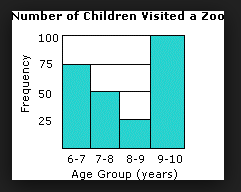
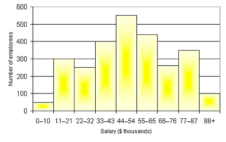
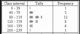
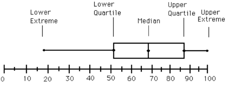
In 2013-2014 Pennsylvania adopted the Pennsylvania Common Core Standards, the states version so the National Common Core Standards. Data visualization is a key part of the 6th grade PA Core Standards. To meet these standards I have decided to utilize Project Based Learning (PBL) to increase student motivation and ownership of their work. The PA Core Standards include three main shifts from original standards, one of them being rigor. Traditionally students have been taught procedural skill and fluency but the definition of rigor states that students must “pursue conceptual understanding and procedural fluency, and application with equal intensity.” (PA Core Standards Teacher Fact Sheet) According to the PA Core Standards Teacher Fact Sheet the “PA Core Standards require students to demonstrate master of the content which cannot be solely acquired through lecture. Therefore, classroom instruction must focus lesson teacher talk and more on actively engaging students.” PBL is an excellent way to engage students outside of lecture and require students to use higher-order thinking skills. It is imperative for students to learn how to create graphics that provide the viewer with a meaningful representation of the data. Often times, published graphics can be skewed and or not represent the whole picture. According to The Elements of Graphing Data (Cleveland, 1985) “the best graphics show data sets as a whole while also displaying larger trends, which leads to more thorough analyses.” Using graphics to promote student analytical thinking is a key component of a 6th grade data visualization unit. Project Based Learning This unit is based in the principles of Project Based Learning so that students have the opportunity to take full ownership of their work. According to the Larson et al., PBL promotes “deeper conceptual understanding and critical thinking when solving problems, Statistical Question Students begin this project by creating a valid statistical question. Even though students have been collecting and analyzing data through use of dot plots etc. since first grade sixth grade is their first experience analyzing and creating statistical questions. Students need to understand that statistical questions must expect variance or differences in the answers. NCCS 6.SP.1 states “Recognize a statistical question as one that anticipates variability in the data related to the question and accounts for it in the answers. For example, “How old am I?” is not a statistical question but “How old are the students in my school?” is a statistical question because one anticipates variability in students’ ages.” Before proceeding with the project it is imperative that students can differentiate between these types of questions, as their first project step is to create a statistical question that can be administered to a random sample. Line Plots 6th grade is the first time that students have formal statistics instruction however students have been collecting data and using visual representations since 1st grade. As students develop their statistical knowledge in 6th grade it is necessary for them to be able to determine which data visualization technique is the most appropriate or their data set. One of the most simple data visualization techniques that students must master in 6th grade is the dot plot. “Dot plots are simple plots on a number line where each dot represents a piece of data in the data set…and are useful for highlighting the distribution of the data set including clusters, gaps, and outliers.” (6th Grade Mathematics Unpacked Content) Therefore dot plots are an excellent data visualization tool to help students determine trends in data and how the data may or may not be skewed. Histograms Students are introduced to bar graphs in earlier grades and in 6th grade must transition to the use of histograms. Due to students prior knowledge of bar graphs it is imperative that students understand the differences and similarities between bar graphs and histograms before creating a histogram. Similarly to bar graphs, all bars in the histograms must be even widths. Unlike bar graphs the bars in histograms have no spaces and the bars are designed to touch one another. Histograms must have even bins (intervals) on the x-axis as each bar represents a range of data points not just a single data point as in a bar graph. Also the bins should have not have any overlapping numbers. For example, if the first bin is 0-4 the next should be 5-9. Because histograms require students to determine the correct bins prior to creation, frequency tables can be an important tool. Non-Example of a Histogram This histogram shows bins that overlap each other (ie. 6-7 and 7-8). This is the incorrect version of a histogram, as bins should not overlap. Example of a Histogram This shows a correct example of a histogram with evenly spaced bins that do not overlap. Frequency Table To create a frequency table students must first determine even bins for the data set. It is imperative that each bin represents the same number of data points. Example of a Frequency Table In the above example each interval or bin represents 40 data points. The second column shows the tallies to determine how frequently those data points are represented in the data set and the last column shows the frequency. Using the information in this chart, students can create a histogram using the intervals for the x-axis and the frequency for the y-axis in a histogram. Box and Whisker Plots The box and whisker plot, also known as a box plot, is a data visualization technique introduce in 6th grade. Before learning to create a box and whisker plot students must have prior knowledge of median, minimum, maximum, and interquartile range. According to Larson-Hall (2017) a box plot is a great alternative to a bar plots or line graph because it is a data rich graphic including the minimum, maximum, median, and interquartile range. Also, box and whisker plots allow the viewer to analyze the spread and shape of the data without anymore analysis. In a box and whisker plot 50 percent of the data is in the middle “or box” part of the graphic while 25 percent of the data falls within two “whiskers” of the data that extend out to the minimum and maximum. Example of a Box and Whisker Plot Minimum The minimum is the smallest number in a data set also known as the lower extreme. Maximum The maximum is the greatest number in the data set also known as the upper extreme. Median The median falls under the category of a measure of central tendency. The median is the middle number of the data set if the number of data points in the set is odd. If the number of data points in a set is even, the median is the mean (average) of the two middle numbers when ordered from least to greatest or greatest to least.
developing and answering a driving question, and creating high quality products.” Also, PBL allows students to experience problems that arise in everyday life and the workplace and provide students the opportunity to work through them in a controlled environment.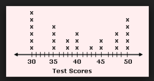
This unit is designed for use in a 6th grade classroom of 25-30 students. It meets National Common Core Standards as well as PA Core Standards and PA Eligible Content. All of the objectives are written in the “Students will be able to” (SWBAT) _______ “in order to” (IOT) format. They each include at least one verb associated with a higher level of Bloom’s Taxonomy. Each objective is concluded with a measurable task. ● SWBAT calculate median, minimum, maximum, and Interquartile Range IOT create a box and whisker plot. ● SWBAT create a statistical question IOT collect data. ● SWBAT analyze histograms and line plots IOT describe the shape of the data. ● SWBAT identify clusters, gaps, outliers, on visual representations of data IOT describe patterns and deviations. ● SWBAT determine even and appropriate intervals IOT to create a histogram. ● SWBAT use Google Sheets IOT to create a box and whisker plot and histogram. ● SWBAT calculate the Interqaurtile Range IOT create a box and whisker plot.
Google Classroom Google Classroom allows teachers to post assignments and students to submit assignments. It also allows teacher to leave feedback for students and highlights the items for change for the students. Students and teacher can continually communicate until a final product is submitted. Guided Notes Most of the lessons in this unit will be self directed, guided by the students personal statistical question after a mini lesson with guided notes has been completed. The guided notes will reinforce important terminology and highlight key aspects of the various data visualization techniques. Project Based Learning Students will be completing unique projects that are guided by their own collection of data. Data Collection Students will design a statistical question and collect at least 30 data points for their sample. Creation and Interpretation of Graphs Students will use Google Sheets to create visual representations of data. Students will also create graphs by hand. Students will be able to interpret the data using the graphs and describe how the data is skewed and any patterns. Peer Monitoring Due to the self directed nature of this unit students will frequently be assessing each other’s work using teacher derived assessment materials. This allows students opportunities to explore how they will be graded and provide each other with meaningful feedback. Check-In Because this unit is based in project based learning there is not a great deal of direct instruction. After receiving multiple mini lessons, students will be working on their individual projects analyzing the data collected from their own statistical question. Therefore I plan to check in with each student at least twice a week to ensure their understanding and answer any questions. I will also be regularly communicating with them via Google Classroom.
Lesson Trajectory Lesson 1: Introduction to Histograms Lesson 2: Creating Histograms for Statistical Question * Lesson 3: Analyzing Histograms Lesson 4: Intro to Box and Whisker Plots * Lesson 5: Weather Data Box and Whisker Plots Lesson 6: Creating and Analyzing Box and Whisker Plot for Statistical Question *Plans for starred lessons are included Lesson 2 Creating a Histogram Lesson 4 Box and Whisker Plots Because box and whisker plots are an entirely new concept in 6th grade and based off of Interqaurtile Range, another new concept, this lesson will include more whole group instruction than the other lessons in this unit. [For additional lesson plans and appendices please see PDF attached above]
Standard
6.SP.B.4. Display numerical data in plots on a number line, including dot plots, histograms, and box plots.
Objective
Materials
Timeline
A 75 minute to 90 minute block would be appropriate for this lesson and would allow teacher time for check in meetings with students while they work.
Lesson Activities
Evaluation
Standard
6.SP.B.4 Display numerical data in plots on a number line, including dot plots, histograms, and box plots.
Objective
Materials
Timeline
This lesson will take approximately 30 to 45 minutes in a 6th grade class with approximately 25 students. If working in 90-minute blocks it can be combined with another lesson.
Anticipatory Set
Direct Instruction
Guided Learning
Closure/ Check for Understanding
PA Core Standards CC.2.4.6.B.1 Demonstrate an understanding of statistical variability by displaying, analyzing, and summarizing distributions. National Common Core Standards CCSS.MATH.CONTENT.6.SP.A.1: Recognize a statistical question as one that anticipates variability in the data related to the question and accounts for it in the answers. For example, “How old am I?” is not a statistical question, but “How old are the students in my school?” is a statistical question because one anticipates variability in students’ ages. CCSS.MATH.CONTENT.6.SP.A.2: Understand that a set of data collected to answer a statistical question has a distribution which can be described by its center, spread, and overall shape. CCSS.MATH.CONTENT.6.SP.A.3: Recognize that a measure of center for a numerical data set summarizes all of its values with a single number, while a measure of variation describes how its values vary with a single number. CCSS.MATH.CONTENT.6.SP.B.4: Display numerical data in plots on a number line, including dot plots, histograms, and box plots. CCSS.MATH.CONTENT.6.SP.B.5: Summarize numerical data sets in relation to their context, such as by: CCSS.MATH.CONTENT.6.SP.B.5.A: Reporting the number of observations. CCSS.MATH.CONTENT.6.SP.B.5.B: Describing the nature of the attribute under investigation, including how it was measured and its units of measurement. CCSS.MATH.CONTENT.6.SP.B.5.C: Giving quantitative measures of center (median and/or mean) and variability (interquartile range and/or mean absolute deviation), as well as describing any overall pattern and any striking deviations from the overall pattern with reference to the context in which the data were gathered. CCSS.MATH.CONTENT.6.SP.B.5.D: Relating the choice of measures of center and variability to the shape of the data distribution and the context in which the data were gathered. ASSESSMENT ANCHOR M06.D-S.1 Demonstrate understanding of statistical variability by summarizing and describing distributions. DESCRIPTOR ELIGIBLE CONTENT M06.D-S.1.1 Display, analyze, and summarize numerical data sets in relation to their context. Eligible Content M06.D-S.1.1.1 Display numerical data in plots on a number line, including line plots, histograms, and box-and whisker plots. M06.D-S.1.1.2 Determine quantitative measures of center (e.g., median, mean, mode) and variability (e.g., range, interquartile range, mean absolute deviation). M06.D-S.1.1.3 Describe any overall pattern and any deviations from the overall pattern with reference to the context in which the data were gathered. M06.D-S.1.1.4 Relate the choice of measures of center and variability to the shape of the data distribution and the context in which the data were gathered.
Cleveland, W.S. (1985). The elements of graphing data. Monterey, CA. Wadsworth Books and Software. This source provides the reader with various different ways to represent data. The key characteristics of data visualization are explained. Groth, R. Bargagliotti, A. Seeing the core of statistics. Mathematics Teaching in the Middle School. 18(1). 39-45. This source provides a great deal of information on connecting statistics education and the Common Core Standards. It stresses the importance of teachers engaging in four processes of statistical investigation. Larmer, J., Mergendoller, J., Boss, S. (2015). Setting the standard for project based learning: a proven approach to rigorous classroom instruction. Alexandria, VA. ASCD. This book provides a concrete foundation for why project based learning should be implemented in classrooms and discusses the effect it has on learning. Lason-Hall, J. (2017). Moving beyond the bar plot and the line graph to create informative and attractive graphics. The Modern Language Journal. 101(1). 244-270. This source discusses the important shift from elementary data visualization to middle school data visualization and the steps teachers need to take to keep their students moving forward. North Carolina Department of Public Instruction. (2012). 6th grade mathematics content unpacked Retrieved from https://www.monet.k12.ca.us/documents%5Cmath%5Ck-6%5CCommon%20Core%20State%20Standards%5CCommon%20Core%20-%20Math%5CGrade%206%20-%20Common%20Core%20Math%5CUnpacked%20Common%20Core%20Standards%20-%20Gr.%206%5CUnpacked%20Common%20Core%20Standards%20-%206.pdf This resource outlines all the changes made to the Common Core Standards and identifies areas for teachers to focus instruction.