
Statistics are part of our lives and therefore an important skill for students to learn. The goal of this unit is to explain and explore scatter plots in a way that is both engaging and informative to eighth grade students. With the transition to the Common Core Curriculum, there is a renewed focus on designing lessons that connect mathematics to real life situations. This unit will help middle school teachers introduce and teach scatter plots to their students in a way that meets the new educational standards and engages students. I have tried parts of the unit with my own class and the students not only learned but they enjoyed themselves.
The unit is designed for ninety-minute class periods, but it can be adjusted for shorter class periods. There are five units in all. Students will start by learning how to read and interpret scatter plots. Then students will read and interpret a newspaper article called “Does this Ad Make Me Fat” by C. Matters and D. Simons, which discusses whether a correlation exists between fast food ads and obesity. The unit will conclude by having the students gathering their own data, creating a scatter plot, and then interpreting their findings.
Statistics are part of our lives. We are confronted with them more than any of us realize, whether it is while watching the news, surfing the Internet, participating in discussions of modern issues, or even reading a report card. This makes understanding statistics a very important life skill. Due to its importance in everyday life, it seems imperative we teach statistics in our classrooms. As stated by A Research Companion to Principles and Standards for School Mathematics (2007), statistics was not previously taught until post-secondary schools and as a result many teachers have a weak background for statistics and are not entirely sure how to teach the topics (Kilpacktrick, Martin & Schifter, 2007, p. 193). Therefore not only do we need to focus on statistics in the classroom, but also on supporting our educators when teaching these topics. Pennsylvania is transitioning to the Common Core Standards, which focus on presenting topics in real world situations. During a regional professional development, many of my colleagues expressed that this transition has been challenging because they are unsure of how to incorporate and supplement this new curriculum. Currently, there are not many materials available that align with the Common Core Standards, which makes it increasingly more important to develop lessons that are aligned to these new standards and improve upon the quality of instruction given. This unit is aligned and developed to support the common core standards for eighth grade mathematics, even more specifically, data analysis and statistics. One of the big foci of this unit will be to move students towards the ability to reason with data. It has been my observation that many of my students are able to construct and collect data, however they are unable to reason or draw conclusion based upon data and displays. As stated by Kirdpacktrick (2007), “In schools…students make graphs for the purpose of making graphs” (p.201). This unit will teach students how to create, interpret, and analysis bivariate data through the use of scatter plots (Kilpacktrick, Martin & Schifter, 2007, p. 201). Pennsylvania has just joined the Common Core State Standards Initiative. The common core is a set of grade-level standards meant to teach students topics that they will need to be successful in their educational futures. The aim is to move away from seeing mathematics in isolation and use skills in context. This unit will be designed around the Common Core Standards for Mathematics. (“Common core state,” 2012). This unit is aligned to the eighth grade standards for Data Analysis and Probability, released by the Pennsylvania Department of Education, which require students to: According to The National Council of Teachers of Mathematics (2003), students benefit from being given the opportunity to develop their own understanding of scatter plots before being provided with terminology (p. 68). By having the students draw conclusions and explore the data in their groups, they will be more likely to remember the content being learned instead of having it be presented to them; this is the basis for inquiry-based learning. When provided with different examples of data to explore, and by presenting examples of relationships and non-relationships, students’ understanding of the types of correlations will improve. These are just a few examples of how I will implement mathematical best practices into my unit to improve student achievement and meet the unit objectives. Mathematical Background: Scatter plots are visual representations that allow individuals to easily see if there is a correlation between two interval-level variables. Correlation is evident when two variables are increasing or decreasing together, or when one variable increases while the other decreases. When variables increase or decrease in this fashion, they start to resemble a line. The more uniformed the line, the stronger the correlation between the variables. The further data are from forming a line the weaker the correlation. When a correlation exists, a line of best fit, or regression line, can be created. Another important concept is that correlation does not necessary mean causation. Just because there appears to be a correlation between variables does not mean that there is a relationship between the two variables. The article Does This Ad Make Me Fat, published in The New York Times, gave an excellent example of how correlation does not equal causation. It discussed a study done by a team of researches as part of the journal BMC Public Health. They were doing a cross study between “outdoor advertising, obesity, and soda consumption” (Matter, Chabris & Simons, 2013). What they found was that the neighborhoods that had more fast food advertisements also had higher rates of obesity, which indicated a correlation. This does not mean that the advertisements are causing obesity. The article suggests that possibly the fast food restaurants looked for areas with higher obesity to advertise because they found obese people were more likely to eat fast food. This is a prime example of how correlation does not equal causation. Scatter plot: “a graph drawn to represent bivariate, numerical data” (Bright, Brewer, McClain & Mooney, 2003, p. 68). Independent variables: is a variable that is not affected by other factors (National Center for Education Statistics). Dependent variables: is a variable that is affected by another factor (National Center for Education Statistics). Bivariate Data: “data for two variables (usually two types of related data)” (Pierce, 2011). Positive Correlation: is when the values of both variables are increasing or decreasing together (Lanthier, 2002). Negative Correlation: is when one variable value increases the other variables value decreases (Lanthier, 2002). Line of best fit: “A line on a graph showing the general direction that a group of points seem to be heading” (Pierce, 2011).
Some important vocabulary that students and teachers need to be familiar with for this unit:
This unit consists of approximately five lessons designed for ninety-minute class periods. The unit objectives will be as follows: Students will be able to
A common strategy in mathematics classrooms across Philadelphia is the gradual release method, or “I Do, We Do, You Do.” The teacher introduces the material and models how to work through the problems. Then students work in groups to refine their understanding. Then finally students will work independently to test their own knowledge of the topic that was just taught. During this stage the students can use their notes (Levy, 2007). Some of the lessons in this unit will follow this instructional format. Another strategy that will be implemented is inquiry-based learning. The idea behind inquiry-based learning is that students will learn by exploring concepts in groups and, as a result, they will construct their own knowledge of the topic (Szalavitz & Exline, 2004). The teacher will start by activating prior knowledge of the students. The teacher will then explain the activity they will be completing. The teacher’s role will be to monitor the groups and to help push their understanding further through questioning. Currently, students are fairly competent at creating data displays and at answering straightforward questions pertaining to the display. The problem is students do not think critically. During my research I found an approach for getting students to think critically about statistics, which I implemented into this unit. Burrill and Elliott (2006) suggest a four-step approach for getting students to think critically about the statistics they are being presented with: (1) Question the question (2) examining what the data do not say, (3) analyzing the categories for the data, and (4) identifying the background knowledge and experience of the sample population (p. 32). To question the question means to analyze the motive or reasoning behind asking the question. Burrill and Elliott (2006) gave the example of a teacher surveying her class on their favorite snacks. The only options the students had to choose from were different types of fruit. After the survey was completed one of the students asked, why did you only include fruits? The teacher responded that she wanted to only focus on healthy snacks so she chose to only have fruits as an option. This technique is important because the original question being asked is often designed for a specific purpose (Burrill & Elliott, 2006, p. 32-33). Examining what is not stated in data or the representation of data helps students to think beyond what is stated and moves them towards critical thinking. Why was the information left out? How can this change my perception of the data? Examining what is not being stated can be just as informative as looking at what is being displayed as long as they have the background knowledge necessary to do it. By looking at what is not displayed or explained in data students can gain “healthy skepticism towards numerical information” (Burrill & Elliott, 2006, p. 34). Analyzing the categories is the third strategy. This strategy is intended for students to use when determining how they measured different intervals. For example Burrill and Elliott (2006) examined “The Birth-Order Blues” (p. 34). This study examined the “pros and cons” of birth order. This raised a lot of questions: what is considered a middle child? Do you include stepchildren or half-siblings? Questions like these can alter how you shift the categories around, which can change the result drastically. This reminds me of a discussion that we had in our seminar, Painless Statistics for Teachers and for Teaching, about whether blondes actually have more fun. Some questions that were raised were: how do you determine what a blonde is? Is it someone who dyed their hair or someone who is naturally blonde? Also how blonde should they be? Does a dirty blonde count? What about highlights? These are all examples of questions that could be asked in order to determine how the information was categorized. Finally, examining the background knowledge and experience of a sample population can also have a dramatic effect on the results. If you are looking at results of individuals’ favorite foods, this can change based on ethnicity of the community and the availability of certain foods in that area (Burrill & Elliott, 2006, p. 32-35).
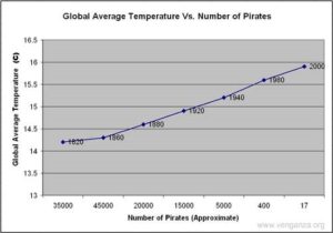
Before the first lesson students need to be able to read simple graphs such as line graphs. Students will also need to be fluent with coordinate plane vocabulary and identifying coordinates. It would be beneficial to review Cartesian plotting before beginning this unit. Students should also have a basic understanding of central tendency and outliers. During the first activity, I recommend allowing students to work in groups of two to four to enable them to share ideas with each other. Each group of students should be given a scatter plot. Some groups’ scatter plots will have negative correlations and others will have positive correlations. First, students will generate a list of observations and questions about the display (see Appendix A. Appendix C and the bibliography contain additional examples of scatter plots that can be handed out to other groups.) Then students will be given several questions to help expand their thinking (see Appendix B). The questions below will be especially beneficial for struggling learners: While the students are working, circulate among the groups to make sure that they are on the right track. If students appear to be struggling, feel free to ask probing questions. When the students have completed the assignment, have them share their findings with the class. It is important to display the scatter plots as they are discussed using an overhead projector or Smart Board. After the students have shared what they noticed and discovered, explain how scatter plots are used to show correlations between two variables. Introduce the students to the concepts of positive, negative, and no correlation. You can use the following website to retrieve a sample of different types of correlations along with their strengths: http://www.regentsprep.org/Regents/math/ALGEBRA/AD4/scatter.htm. Students need to be shown concrete examples of each type of correlation. Make sure to display scatter plots with stronger and weaker correlations, whether negative or positive. Have students answer the following questions about some select scatter plots: Close the lesson by reviewing the vocabulary and what was taught. What is the purpose of a scatter plot? What type of information does it show you? How are they different from line graphs? Students will be able to analyze different scatter plots that show correlation does not automatically mean causation. This lesson begins by giving students a newspaper article that discusses correlation. One good example is The New York Times article mentioned in the mathematical background section of this unit called “Does This Ad Make Me Fat?” A link to this article can be found in the section called “Scatter Plot Resources” below. The article discusses a correlation study in which the researches took the leap from correlation to causation prematurely. Allow students to read the first seven paragraphs and then discuss what the study found. Does it seem possible that if there are more fast food advertisements that there will be more obese people, or that these signs are causing people to become obese? Allow the class to discuss this idea. Ideally the students will mention the possibility of a variable not mentioned in the beginning of the article and if no one does, help to lead them there. Sample leading questions are: Record some of their ideas about possible third factors on the board. Then allow them to continue reading. When they have finished, discuss the findings in the article and compare it to what the class has come up with. After discussing the newspaper article come back to the actual scatter plots. Just because a correlation exists, does that mean that the variables are connected? Students will then be given scatter plots that correlate but do not have causation. They will be extremes. Students will look at these scatter plots and brainstorm reasons as to why they seem to correlate, but are most likely unrelated. What third factors could be coming into play? Why do these factors correlate? Do they have a relationship with a common third factor? There is a scatter plot on http://biojournalism.com/2012/08/correlation-vs-causation/ that shows Global Average Temperatures vs. Number of Pirates. The scatter plot below is slightly adapted from that site. Students will be given a scatter plot. Explain to students that when there is a strong correlation between two variables, a line of best fit can be drawn to represent the trends of the data. There are two purposes of the line of best fit. One is to represent the trends in the data, and the second is to help make predictions based off of current results. Begin by showing a simple line graph to the students. Have a student demonstrate how easy it is to draw a line for the data plotted on the graph. They can simply connect the first dot to the last dot. Then show them a scatter plot such as the one retrieved from http://www.purplemath.com/modules/scattreg3.htm. Connect the first and last data points on the scatter plot. Ask the students if the line fits the data points? The answer is no. This shows how connecting the first and last data points for this scatter plot does not provide us with a line that represents the data as a whole. (Stapel, 2013) The students’ tasks will be to draw their own line of best fit. They will use a piece of dry spaghetti as their line. When they are determining where they think the line should fall on the scatter plot they need to answer the following questions. The purpose is to guide them to justify why their line is best placed. They will tape the dry spaghetti to the scatter plot and attach their justification. Some groups can share their justifications for their lines with the rest of the class. It was mentioned the previous day that predictions could be made using scatter plots. What predictions could you make for your scatter plot? What appears to happen when variable x increases? What happens to the value of y? Based on what appears to happen in the scatter plot, can you make a prediction for other values not shown on the graph? Encourage the students to make predictions specific to the scatter plot. If you have a particularly advanced class this would be a good chance to calculate a line of regression. The students can compare their own lines to Pearson’s line of regression. For additional scatter plots without causation: http://tellingthestory.typepad.com/telling_the_story/2010/06/ Students will be able to construct a scatter plot to deepen their understanding of the structure. In this lesson, students will gather data that will be used to construct their own scatter plot. Start by modeling how to create a scatter plot. Show students how to determine intervals and to plot the data using one variable as your x-coordinate and the other variable as your y-coordinate. Make sure to stress to the students how important it is to label each axis and title the graph. For data collection, form partnerships among students so that they can measure each other’s height in inches as well as their foot size in inches (you may choose to use a different measure). The students will record their answers on the board. Before the scatter plot is constructed they will make predictions about whether they think there is a correlation present and if so what type of correlation. The students will plot the coordinates with the two variables, height (x-axis) and shoe size (y-axis). Have the students choose a line of best fit for their graph. Once the graph is created, ask the students how their experience differed when looking at the data in the table compared to looking at the graph. Have them answer the following questions about their display: 1) What do you predict the shoe size of someone who is 72 inches tall would be? 2) What type of correlations does it have? 3) Why do you think that these variables have this type of correlation? 4) What connection do you think these variables have, if any (independent vs. dependent)? Explain your thinking. End the lesson by having a few students show the class their scatter plots and talk about the responses to the questions.Lesson 1 and 2:
Objectives:
Lesson 3:
Objective:
Lesson 4:
Objectives:

Lesson 5:
Objective:
Bright, G., Brewer, W., McClain, K., & Mooney, E. (2003). Navigating through data analysis in grades 6-8. (3rd ed.). Reston: The National Council of Teachers of Mathematics, I. This book provides many backline masters for worksheets as well as methods for teaching with these resources. There is an entire section on bivariate data. This will be a source for teachers and students. This is an excellent source for teachers who struggle when it comes to teaching data and statistics in the middle school classroom. Burrill, G. F., & Elliott, P. C. (2006). Thinking and reasoning with data and chance. Reston, VA: The National Council of Teachers of Mathematics, Inc. This is an excellent source for methodology for teaching data and chance. If you are unsure about where to start or which methods to use in order to push students’ thinking beyond being able to regurgitate information, this book is a good source. Kilpacktrick, J., Martin, G. W., & Schifter, D. (2007). A research companion to principles and standards for school mathematics. (2rd ed., pp. 193-261). Reston, VA: The National Council of Teachers of Mathematics, Inc. This textbook discusses the standards of statistics and data analysis along with the importance of each topic. It also discussed the value in having students create a data display by hand. There are also ideas for other mathematics domains. Lanthier, E. (2002, March 29). Correlation. Retrieved from http://www.nvcc.edu/home/elanthier/methods/correlation.htm This website gives an explanation of correlations as well as examples of scatter plots that can be used. Levy, E. (2007). Gradual release of responsibility: I do, we do, you do. Retrieved from http://www.sjboces.org/doc/Gifted/GradualReleaseResponsibilityJan08.pdf This website explains the gradual release method at a glance. National Center for Education Statistics. (n.d.). Kids’ zone learning with NCES: Independent and dependent variables. Retrieved from http://nces.ed.gov/nceskids/help/user_guide/graph/variables.asp This is a great site for vocabulary and creating simple graphs. There are a lot of fun additions in the “Grab Bag” section of the website, including math teasers and multimedia clips. Pennsylvania Department of Education. (2011, January 31). Grade level – 8th grade. Retrieved from http://static.pdesas.org/content/documents/Math Emphasis Guide from PA to CCSS – Grade 8.pdf This site is a source that informs teachers what background students entering the eighth grade should have and where their knowledge should be moving throughout the course of the year. Pierce, Rod. (7 Aug 2011). “Definition of Bivariate Data”. Math Is Fun. Retrieved 11 Apr 2013 from http://www.mathsisfun.com/definitions/bivariate-data.html A website that defines different mathematics vocabulary and gives examples. Pierce, Rod. (25 Aug 2011). “Definition of Line of Best Fit”. Math Is Fun. Retrieved 11 Apr 2013 from http://www.mathsisfun.com/definitions/line-of-best-fit.html A website that defines different mathematics vocabulary and gives examples. Shulte, A. P., & Smart, J. R. (1981). Teaching statistics and probability. Reston, Virginia: The National Council of Teachers of Mathematics, Inc. This book provides many examples for teaching probability and probability games. There is also a section in the back of the book that provides ideas for projects that can be done with students. This book’s major focus is the connection between statistics and probability. Szalavitz, M., & Exline, J. (2004). Concept to classroom workshop: Inquiry based learning. Retrieved from http://www.thirteen.org/edonline/concept2class/inquiry/index.html This website describes what inquiry based learning is, how it is different from the traditional approach, as well as the benefits. It also provides demonstrations of inquiry based learning science lessons so that a teacher can see the practice in action. My favorite part of the website is the implantation tab which not only shows you how to foster it in students but also how to plan for it. Van de Walle, J. (2007). Elementary and middle school mathematics. (6 ed., pp. 452-474). Pearson Education, Inc. This text provides methods to teach different mathematics topics from kindergarten through eighth grade. I found this to be a great resource book. It is effective for developing new ways to teach concepts as well as enhance your own understanding.
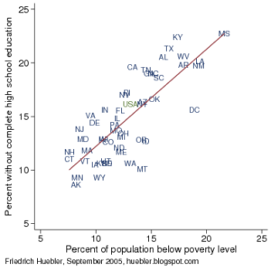
Bright, G., Brewer, W., McClain, K., & Mooney, E. (2003). Navigating through data analysis in grades 6-8. (3rd ed.). Reston: The National Council of Teachers of Mathematics, I. Matter, G., Chabris, C., & Simons, D. (2013, March 10). Does this ad make me fat? The New York Times. Retrieved from http://www.nytimes.com/2013/03/10/opinion/sunday/does-this-ad-make-me-fat.html?_r=0 Article to be used with students during lesson three. It discusses the correlation between obesity and fast food ads. Roberts, D. (2012). Scatter plots and correlation. Retrieved from http://www.regentsprep.org/Regents/math/ALGEBRA/AD4/scatter.htm. This website provides examples of different correlations and their strengths. Huebler, F. (2005, September 12). Poverty and education attainment in the united states, part 2. Retrieved from http://huebler.blogspot.com/2005/09/poverty-and-educational-attainment-in_12.html This website had a scatter plot showing the correlation between poverty and education levels. It is a great scatter plot for Activity One. Johnson, B. (2010, June 22). Cum hoc ergo propter hoc (with this, therefore because of this). Retrieved from http://tellingthestory.typepad.com/telling_the_story/2010/06/ A scatter plot that shows correlation does not cause causation. It is suggested that the word murder be replaced with crime rate before being reproduced. Kentner, K. (n.d.). The ice cream murders: Correlation vs. causation. Retrieved from http://biojournalism.com/2012/08/correlation-vs-causation/ This is the website for the pirate scatter plot. Matter, G., Chabris, C., & Simons, D. (2013, March 10). Does this ad make me fat? The New York Times. Retrieved from http://www.nytimes.com/2013/03/10/opinion/sunday/does-this-ad-make-me-fat.html?_r=0 Article to be used with students during Lesson Three. It describes the correlation between obesity and fast food ads. Roberts, D. (2012). Scatter plots and correlation. Retrieved from http://www.regentsprep.org/Regents/math/ALGEBRA/AD4/scatter.htm Article to be used with students during Lesson Three. It elaborates on the correlation between obesity and fast food ads.Scatter Plot Resources:
What do you notice about the scatter plot? What questions does this scatter plot raise?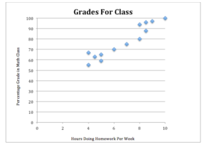
Name: _____________________________________________ Date: ________________________
Assessment Anchor: M08.D-S.1 Investigate patterns of association in bivariate data. Descriptor: M08.D-S.1.1 Analyze and interpret bivariate data displays in multiple representations. Eligible Content: M08.D-S.1.1.2: For scatter plots that suggest a linear association, identify a line of best fit by judging the closeness of data points to the line.Pennsylvania Common Core Standards