Cart 0

Philadelphia’s Population Change: Using Data Visualization to Understand a Historical Narrative

Author: Andrew Guyon

School/Organization:

School District of Philadelphia

Year: 2020

Seminar: The City in History

Grade Level: 5-8

Keywords: Data visualization, historical narrative, mathematics lesson, Philadelphia history, quantitative data

School Subject(s): Math

The intent of this unit is to provide mathematics mini-lessons and resources to teach students how to interpret and apply quantitative data in the context of the social sciences. A new curriculum for middle school students was created by the School District of Philadelphia in 2019 in collaboration with professional curriculum writers and social studies teachers. These new resources allow the district’s social studies teachers to plan and modify instruction as they see fit to best meet the diverse learning needs of their students based on factors such as student choice, assessment data, English language proficiency, and a wide range of reading levels.

The present unit provides ample opportunity for interdisciplinary work. Mathematics is often taught in isolation from the other core subjects such as social studies and ELA (Protheroe, 2007). Ultimately, this curriculum project will encourage cross-curricular instruction for 7th and 8th graders across subject areas by providing opportunities for collaboration between math and social studies classrooms. Students will apply mathematics concepts in real-world settings to visualize the scale of human geography. They will use historical data to determine changes in population over time, which serves to enhance the student understanding of both social studies and mathematics concepts.

Knowledge obtained from participating in The City in History seminar will guide my curricular unit supplement. The unit will use mathematical concepts to better understand the growth, or decline, of city populations, specifically those of Philadelphia. Traditionally, mathematics is taught in isolation, separate from other subjects. Rote memorization of facts and algorithms in mathematics classrooms has not encouraged critical thinking nor has it challenged students to use real-world settings. Teachers are rarely afforded common planning time with their grade partners and as a result mathematics is taught out of context and students are not able to see that what they are learning in the classroom has applications outside of school. However, there are avenues within the existing curriculum for interdisciplinary work that may deepen student understanding across several subjects. For example, 7th graders in Philadelphia learn about Ancient Greece in social studies. These lessons include simulations in which students consider the percentage of Athenians who were eligible to participate in direct democracy. Students are asked to propose a law based on a specific social problem and are then given role cards explaining what character they are playing.  Once the requirements for participation in direct democracy are explained, those who are eligible sit at a table to discuss laws, and those who are ineligible stand around the room, unable to contribute. This allows for clear visualization of who was included and who was excluded, from the actual make up of the legislative body to the number of votes needed to “pass a law” in relation to the total population. This allows students to ask questions about proportion and percentages outside of the mathematics classroom and learn about the world around them, make predictions, quantify their observations and come to conclusions based on historical data.

There are existing frameworks in place that allow for the melding of content areas. At the national level there are new standards that support cross-curricular instruction. For example, the Next Generation Science Standards combine concepts in mathematics, English Language Arts, and science: cause and effect; structures and functions; systems and system models; patterns; energy and matter; and scale, proportions and quantities. The C3 Framework (College, Career and Civic Life) for Social Studies instruction also focuses on cross-curricular instruction, with an emphasis on meaningful student inquiry. With the advent of common planning time for grade teams, such as Professional Learning Communities, it is now possible for teachers to plan across content areas and to reinforce skills and apply concepts in more than one subject. This unit will provide starting points for math and social studies teachers to collaborate in regard to teaching the history of Philadelphia to 7th and 8th grade students.

Download Unit: Andrew-Guyon.pdf

Did you try this unit in your classroom? Give us your feedback here.


Full Unit Text
Content Objectives

Rationale

My intention with this curriculum project is to increase student engagement and critical thinking skills by encouraging students to make sense of real-world phenomena. Students will be asked to analyze population data, graph the data, and draw conclusions about changes in population based on numerical and historical evidence. Students will also be asked to estimate projections of population increases or decreases based on current trends. For example, teachers can provide students with raw population data and ask them to predict a percent increase or decrease in Philadelphia’s population in 2021. Students will support their conclusions with data and explain factors they believe are causing the change. The social studies teacher will provide context and make connections to prior historical events while the math teacher will provide the tools for understanding numerical data, creating graphs, or making calculations. Fusing math and social studies, lessons should enhance students’ understanding of historical facts, help them draw and defend conclusions, and explain their reasoning. Another advantage is that this fusion embeds the need to learn the mathematical skill in an authentic motivation: the desire to understand historical trends and patterns. The lesson plans below are a guide for middle school mathematics and social studies teachers to supplement existing curricula by visualizing historical data in new ways.

How will this be accomplished? Using the Common Core’s Standards of Mathematical Practice, which can be applied across content areas, students will extend mathematical thinking to a social studies setting. Students require repeated exposure to math content outside of the mathematics classroom in order to build connections and retain information. Teachers must offer students a variety of ways to visualize data using line graphs, pie charts, and models in different subject classes.  Historical data tells a story, and students will be asked to write their own narrative of our city with help from both the math and social studies teachers. Students will investigate Census Bureau data in various forms and seek to answer essential questions posed by the teachers provided in the lesson plans below. Students are also encouraged to ask their own questions, hence the use of the Notice and Wonder activity which asks for 100% participation and engagement.

Students will have repeated exposure to applications of percentages in math class and will apply this learning to social studies concepts. For example, once students have learned how to find percent change in a math classroom, they can then analyze historical data line graphs–about population decline or wage increases, for example–in social studies class and make inferences about the impact and historical context. Teachers can ask students to read about population change and host a debate about most important causes. Some social studies standards, which are closely linked to ELA standards, that could be implemented in this interdisciplinary unit include: citing specific textual evidence to support analysis of primary and secondary sources (Ex.The population trend line keeps decreasing. What does the data in this graph suggest about the Spanish Influenza outbreak in American cities?); determining the central ideas or information of a primary or secondary source (Ex.What story is this graph telling?); providing an accurate summary of the source that may challenge your prior opinions (Ex. Use a graph to tell a story in your own words using data points along the graph. What surprises you about this graph? How does this graph change what you thought you knew about the subject before?); and integrating visual information in charts, graphs, and maps (Ex. Applying scale on a map, create a historical timeline and find the population change each decade). The new social studies curriculum incorporates many such activities and questions, but students may not have the mathematical skills to answer these questions in any depth.  Coordination with math teachers will help in this area.

Studying population change in Philadelphia allows students to evaluate data and come up with their own sketch of city history based on the numbers. Factors that lead to population change that students can learn about include but are not limited to: natural changes such as births and deaths; domestic and international immigration; job growth and loss in manufacturing and commerce; the 1854 incorporation of neighborhoods into the official city borders and population; and changing ethnic composition.

My ultimate goal is to increase students’ mathematical capacities and help them see data in a new light. Some of the population graphs provided in the Appendix are rather complex, but students are able to grasp concepts within their zone of proximal development if they are challenged and provided appropriate scaffolding. Traditionally, a math teacher would teach a procedure and have students practice problem solving. We are now encouraging the Productive Struggle approach by being less helpful and encouraging risk taking. The Productive Struggle embodies the approach I am aiming to take- which is to start with a question, rather than a procedure or algorithm to follow, and empower students to use their problem solving skills and find a solution on their own. If you are new to the Productive Struggle, consider watching Dan Meyer’s  “Math Class Needs a Makeover” TED Talk for more insight.

Background

I have been teaching ELA, Science and Mathematics in Title 1 schools for the past decade in North Philadelphia. These schools have underserved student populations with >90% living in poverty and receiving free or reduced-price lunch. These schools are stigmatized as “failing schools” based on their lack of Adequate Yearly Progress (AYP) on summative state assessments such as the PSSA and NAEP.

There is a litany of factors that contribute to the labels of “failing schools.” Some of these factors include, but are not limited to: large class sizes, inexperienced teachers, high teacher turnover rates, public school funding formulas, and excessive concern for testing. Math teachers are expected to “teach the test” and cover 45 standards in 36 weeks in 7th grade. This year I have transitioned to a role as a new teacher coach, in order to broaden my scope, learn new skills, and work in a variety of settings. In my role, I am finding that new math teachers tend to teach as they were taught: math is its own island, separate from other subjects, largely out of context or in hypothetical situations. What we are seeing in classrooms so far is the opposite of what the Common Core standards expect, hence my desire to reform how we teach mathematics.

Although memorizing your times tables is useful, mathematics that has been taught in underfunded public schools is frequently rote memorization of facts and formulas. These classrooms focus on using procedural fluency and skill practice, but often skip over the conceptual understanding that is desperately needed for all students, especially those who might be two or more grade levels behind, have learning differences, or who are learning English as a second (or third) language. As the current focus on procedural fluency is failing our urban, public school students, there will also be a greater focus on the application of the skills in this unit, such as predicting population changes through graphs or tables using real-world census data. By repeatedly exposing students to math concepts in other settings, they will be able to apply higher order thinking skills (Ex. analyzing data, synthesizing info. on multiple graphs).

Historical Context: What is a City?

Before diving into a brief overview of Philadelphia’s history, I think it is important to elucidate the concept of a city from our readings and lively class discussions during our course The City In History at Temple University led by Dr. Spodek. Throughout this seminar, ideas for how to incorporate mathematics lessons within this social studies topic became clear.

We began with readings about cities in Ancient Greece and Plato’s economic perspective on cities. He argued that a city, or polis, has an ideal size of about 5,000 citizens and is a place to exchange goods and daily necessities such as food and clothing. These exchanges lead to partnerships, specialization of crafts, and divisions of labor. He also argued that humans have many desires, such as exotic luxuries, but should stick to basic things such as caring for the body, mind and soul through gymnastics, art and music. When populations in Greek cities grew too large, younger residents were encouraged to found their own neighboring towns.

Aristotle built on Plato’s teachings with his notion of zoonpolitikon: man as a political animal. In other words, the city is where you live and learn to be a good statesman or citizen. He believed that only in the polis could a person grow intellectually, spiritually and morally. City fundamentals such as a sense of community and cooperation, individual rights, self-sufficiency and privacy were born. Greek cities were built using the same urban planning design–an acropolis at the summit for worship; the agora for public affairs and commerce; and then homes below.

How does this apply to mathematics? About 1 or 2 out of every 10 residents were able to participate in the Athenian Democracy. White land-owning men who completed military training had the right to vote; women, freed slaves, slaves, foreigners and children were all excluded from voting. The farmers toiling in the fields rarely came to the city to cast their votes. An essential question that can be posed to students would be “Was the Athenian democracy fair and just?” In this case the social studies teacher will present the historical aspects and context, and the math teacher can support students by finding percentages of eligible voters in Ancient Athens. To better visualize how many people are included in this type of democracy, students can imagine 20% of their class voting in an election for class president, with 80% left out. These percentages can then be graphed and compared to present-day percentages of eligible voters in Philadelphia or Athens to determine how democracy has changed and in what capacity it has continued from its inception. Ultimately students will ask their own questions and seek answers through critical thinking and apply math to help them make sense of historical phenomena. Without the mathematics component, students may not be able to fully grasp the concept and develop a strong answer to the essential question.

Consider another application of math in Ancient Greece. For example, in The Polis, British scholar H.D.F. Kitto describes the polis as a self-governing community. He states that the Spartans had “conquered and annexed Messenia, and possessed 3,200 square miles of territory.” (p.42) Population change becomes an important factor. A similar question can be asked, “To what extent was the polis a self-governing community?” The social studies teacher would introduce information about the demographics and population of the newly annexed area, and the math teacher would facilitate various calculations about percentages of residents who actually govern. This can be compared to calculations regarding Spartan governance before annexation or even compared to previous calculations about Athens in order to help students answer the guiding question.

Math connections in Ancient Greece need not stop at percentages to aid visualization and argumentation. Students could be asked to use mathematics to find the total new area of the Spartan territory in terms of square miles (or convert to kilometers), create a scale model of this territory (or of Greek cities) using ratios and proportions, or find the increase in population as percentages to the entire Spartan territory. With some scaffolding, the aforementioned readings are all accessible for a 7th grade reading level and could be read in a social studies classroom. The purpose of these activities is to enhance student understanding of the math functions and the implications and scope of historical events.

Not all writers were as optimistic as Plato and Aristotle about the city. John Lanchester argues in The Case Against Civilization that the interests of individuals are in conflict with the interests of the state. Lanchester claims that our reliance on crops such as grains and cereals have led to the development of cities, as we lack the variety of food sources afforded by our late neolithic ancestors. Yale political science professor James C. Scott is quoted several times in Lanchester’s article. He argues that grains could be easily taxed and were “visible, divisible, assessable, storable, transportable, and ‘rationable.’” Numerical record keeping was born as was the need for mathematics. Supply and demand also created a social hierarchy of the wealthy elite, special laborers, and led to the enslavement of free people for labor. Algebra was created to calculate unknown amounts of goods. With the introduction of money into the class discussion, students can also calculate unit rates, tax percentages, and begin to see wealth disparities of the rich and poor 4,000 years ago. Incorporating mathematics again allows for students to better comprehend day to day life of particular types of people and to empathize with the gaps between social classes.

In What is a City?, social critic and philosopher Lewis Mumford states:

“The city is a related collection of primary groups and purposive associations: The first, like family and neighborhood, are common to all communities, while the second are especially characteristic of city life. These varied groups support themselves through economic organizations that are likewise of a more or less corporate, or at least publicly regulated, character; and they are all housed in permanent structures within a relatively limited area. The essential physical means of a city’s existence are the fixed site, the durable shelter, the permanent facilities for assembly, interchange, and storage; the essential social means are the social division of labor, which serves not merely the economic life but the cultural processes. The city in its complete sense, then, is a geographic plexus, an economic organization, and institutional process, a theatre of social action, and an aesthetic symbol of collective unity….It is in the city, that man’s more purposive activities are focused, and work out, through conflicting and cooperating personalities, events, groups, into more significant culminations.(p. 93)

Mumford describes the city and its groups partly in terms of mathematical functions where the size of a city determines the availability of social functions such as universities. He claims,

“What is more important is to express size always as a function of the social relationships to be served.” (p.93) This concept could be useful for teaching functions (inputs/outputs) in 8th grade. Teachers could have students identify factors that cause populations to change and determine a population’s effects on urban institutions such as transportation, tax revenue, pollution, etc.

To help prove my case for applying math concepts in a social studies setting, it is worth mentioning urbanization. In Urbanization of Human Population, demographics professor Kingsley Davis discusses the rates of change in population of cities, or “the proportion of total population concentrated in an urban settlement.” (p. 24) Urbanization as a function can be explained as an inversely proportional relationship: urban population increases when the rural population decreases; the rural population increases when the urban population decreases. If students are learning about factors that cause people to move to and from cities, then we can use mathematics to help quantify these push and pull factors by visualizing the data. This allows students to grasp complex relationships in context. Essential questions that could be asked include: How does modern urbanization affect economic growth? What are the effects of declining rural population/increasing urban population? How does a fluctuating population affect the cost of living in a city?

One of our sessions this semester focused on city residents who are not counted in the official census. These residents work in an informal economy and are frequently not officially recognized in government records and census data, generally do not pay taxes and lack equal rights and opportunities. It is estimated that 60% of the world’s population work in the informal economy (ILO, 2018).  This begs several questions, which students can unpack in interdisciplinary social studies and math lessons: Who is in our cities? Who has representation and who does not? Of these visible and invisible populations, who lives where and controls what percentage of the wealth? Not only can these concepts be calculated, often through percentages, to bring more depth to the conversation, but they can also be mapped and graphed using mathematics lessons.

There are several organizations such as Women in Informal Employment: Globalizing and Organizing (WIEGO), the Self-Employed Women’s Association (SEWA), and Domestic Workers United that are advancing an equal rights movement to help provide secure employment for 53 million women around the world. These organizations have a manifesto that acts as an equitable conduit between local governments and the informal workers union. They argue that the urban designers do not take into account the needs of workers in the informal economy- such as access to health care, women’s shelters, sanitation, utilities, or open space. The need to recognize these workers is vital, as they lack social protections, and earn low wages. These organizations assist the informal economy as the workers deserve to be heard and recognized, have the opportunity to unionize, negotiate with their employers and government to improve their living conditions. For example, in Pune, India, waste management workers earned higher wages and the necessary protective gear with assistance from these non-governmental organizations (NGOs). Workers received fire safe equipment to protect them on the job in Accra, Ghana, and earned higher wages through the Homeworker Protection Act in Bangkok, Thailand. Urban designers and planners of the future must account for these residents. Using historical information about cities and data from these organizations, students can step into the role of urban planners, using social studies knowledge and math skills to propose solutions to many of these issues.

Another reading apropos of mathematics in urban design is Ebenezer Howard’s Garden Cities of Tomorrow from the turn of the 20th century. The article includes several diagrams that could introduce the concept of scale in finding distance on a map. A social studies teacher could teach about the differences and similarities of Howard’s town, country, and town-country concepts, while the math teacher helps students to determine distances and create their own scale models of cities using Howards’ Garden City design. Furthermore, given the pitfall of depth versus breadth in social studies classrooms, students often lack basic map skills by middle school, which teachers don’t feel they have time to teach. Creating interdisciplinary urban planning projects with a math teacher would benefit both content areas.

Currently in America there are enormous disparities between social groups across the nation and within cities. A New York Times opinion series titled The America We Need calls for economic security and equity of opportunity for historically marginalized groups such as people of color. We are suffering from both racial and economic segregation in our cities caused by systemic and institutionalized racism. According to the article, “Over the past decade, the wealth of the top 1 percent of households has surpassed the combined wealth of the bottom 80%.” (April, 2020) Contributing to this incredible disparity of wealth are successful campaigns of the wealthy blocking social changes such as unionization; these kinds of campaigns date back to the Black Plague in the 1340s! Impoverished neighborhoods were included in city designs, such as Ernest Burgess’ concentric zone model and his premise of ‘social ecology’ that designate social groups such as African Americans, women and immigrants, and clump various ethnic groups with stigmatizing terms such as ‘ghetto’, ‘slum’, ‘underworld,’ ‘Little Sicily’ and ‘Chinatown.’” Burgess poses a great essential question that could be used by either the social studies or math teacher: “What is the significant aspect of movement for the study of the changes in city life?” (p.167) The chance to rise and climb among social groups is in serious decline: a staggering statistic shows the reality of the glass ceiling in America.  Middle school students know that injustice exists, but often lack the language to describe this beyond “it isn’t fair.”  Even the aforementioned examples of wealth disparity and disproportionate death rates will seem unfair to students, but they cannot truly grasp the injustice until they understand the math behind the examples.

Up until now we have spoken mostly about contributions from white men. It is imperative to highlight contributions of others who are too often underrepresented. Civil rights leader and renaissance man, W.E.B. Du Bois, wrote about the disparities between African American communities that were segregated due to racial prejudice. His time in Philadelphia at the turn of the 20th century in the downtown Seventh Ward district described the lives of African American homeowners, businesses owners and craftspeople. An Essential Question that can be asked to students from his work The Philadelphia Negro is “What is the real condition of this group of human beings? Of whom is it composed, what sub-groups and classes exist?” (p.111) Creating a graph or pie chart of this data will help students grasp nuances within or the disparities between social groups. He mentions taking into consideration the physical and environmental factors of a city. A visit to the present-day Seventh Ward in Philadelphia is a great opportunity for a field trip.

One application of mathematics in Du Bois’ writing describes the increase in population in the Seventh Ward: 3,621 in 1860; 4,616 in 1870; and 8,861 in 1890. (p.111) This is an opportunity to apply percent change to understand the increase in population in this neighborhood. Essential Questions could focus on which factors led to this increase in population as well as the social implications of the increase. With over one hundred years of gentrification, the Seventh Ward neighborhood today is part of the ritzy downtown area (Washington Square West), which is demographically different today than Du Bois’ depiction and account of racial prejudice. (Factors contributing to this gentrification include redlining: a prejudicial practice of segregating residents by race and blocking residents of color from owning a home in certain neighborhoods or obtaining a mortgage at a fair interest rate. The disparity of mortgage interest rates could be studied mathematically.) His article provides raw population data for residents of the Seventh Ward, and students can calculate percentages using his data as a primary source. The notion of an opportunity gap is evident during his time in Philadelphia, and still rings true today. Creating a mathematical visual of this opportunity gap using a map of the Seventh Ward would be a powerful learning tool. Du Bois adds that “most white people are quite unconscious of any such powerful and vindictive feeling.” (p.113)

Du Bois summarizes the racial segregation as follows: “Presumably the first impulse of the average Philadelphian would be emphatically to deny any such marked and blighting discrimination as the above against a group of citizens in this metropolis. Everyone knows that in the past color prejudice in the city was deep and passionate; living men can remember when a Negro could not sit in a street car or walk many streets in peace.” (p.114) There is a middle school appropriate movie on this subject. Although it took place some time later, the movie In the Heat of the Night featuring Sidney Poitier describes the illegal incarceration of an African American police officer from Philadelphia wrongly accused of a crime at a train station. This theme leads to another essential question: “What has changed, and what has remained the same since 1899 in Philadelphia for people of color?” Mathematics can be applied in this case to examine wage disparity between whites and Black residents of Philadelphia, and can be compared to present-day wage disparities between the binary genders. Similarly, rates of wrongly incarcerated people from Philadelphia could be calculated and tracked over years, as well as compared to rates of other racial groups.

Another important aspect of population changes in American cities relates to immigration. As the industrial American city emerged with the advent of industrial machines in the 1920s, the reduced need for immigrant labor caused restrictive immigration laws and a population reduction worth examining through a mathematical lens. Influxes of immigration caused by the Irish Potato famine, for example, in the 1840s and its effects can be studied in context. As Sam Bass Warner mentioned in Evolution and Transformation: The American Industrial Metropolis, 1840-1940, cotton textile workers in Philadelphia began to unionize to fight for higher wages and better working conditions thanks to the Clayton Anti-Trust Act in 1914. Warner claims that the state police was established to quell union strikes and mob uprisings. Ideally students themselves will be able to recognize that the implementation of rail lines in the 1850s led to an increase in jobs and population but also were a contributing factor to a rural population shift 100 years later. Social classes were already well established in the city- the wealthy, free African Americans and the poor, mostly comprised of new immigrants. Finally, an essential question from this topic could be: “When does everyone get the right to vote?”

Many of our readings focused on Western cities. One article that was rather interesting about urbanization in East Asia was the article Chinese Cities in a Global Society, written by scholar Tingwei Zhang. The author discusses reforms and factors causing a large population influx, which is important as about 20% of the world population live in China. Middle school students can easily grasp the concept of ‘1 out of 5’ people, but what does that mean in an urban context? Hopefully students will be able to explain some of the implications of having the world’s largest population and 2nd largest economy.

Peter Calthorpe’s speech, Seven Principles for Building Better Cities, plans for sustainable cities in the future focusing on walking, biking, and rapid mass transit systems. His recommendation is to match urban density and transit capacity in order to reduce traffic and pollution. Calthorpe argues that urban sprawl isolates people and segregates them into economic enclaves that are largely separated from nature. With half of the world’s populations living in cities, the estimated population in 2050 will increase by 2.5 billion people.  Calthorpe poses a powerful question- “if 1/3 of the world’s population has cars, why do they get 70% of the street?” Calthorpe provides an ideal futuristic city- one that uses rapid transit buses and trams to reduce congestion and pollution, satisfies housing demands with mixed use buildings and community neighborhoods while also making cities green, walkable places. Combining mathematics and social studies lessons, middle school students too can comprehend this vision for the future.

Philadelphia Past and Present

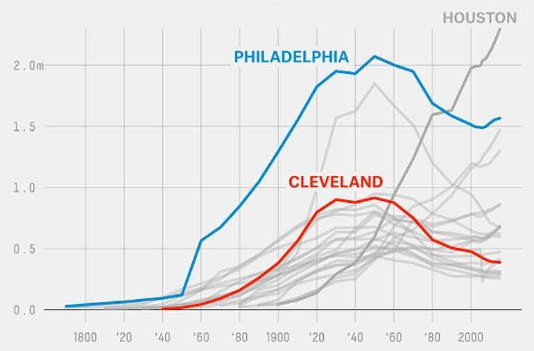
Philadelphia, also known as the “Athens of America,” is a metropolitan city situated in Southeastern Pennsylvania, situated between the Delaware and Schuylkill Rivers with an official population of two million residents. The following is a brief overview of events in Philadelphia’s history, which either caused the population to increase or decrease significantly.

Before being settled in the 17th century by Europeans, the land where Philadelphia now stands was inhabited by Native American tribes, notably Leni-Lenape, Shawnee and Algonquian. The city itself was founded in 1682 by William Penn and in the 1690s had a population of about 600 people. Penn planned the city layout on a grid that included public squares, a town square, and housing layouts. Due to Penn’s urban planning design, the city expanded quickly and grew to a few thousand residents in the early 1700s. Residents were largely Quakers from England who sought freedom from religious persecution. German, Irish and Scottish immigrants arrived and the city continued to grow. There were several incorporations of neighborhoods (in 1701 for example), which allowed the population of the city (and the tax base) to increase. The port of Philadelphia on the Delaware River soon allowed the city to become an industrial center for trading and manufacturing leading up to the American Revolution.

Philadelphia was America’s first World Heritage City, valued by UNESCO for its contributions to world history. Some notable events that took place in Philadelphia were the first public school (1689), Pennsylvania’s first newspaper (1719), the first volunteer fire company (1736), first hospital (1755), the first Continental Congress (1774), and the first American flag (1777) created by Betsy Ross. Philadelphia also hosted the Centennial World Fair in 1876, and is known for creating the “row home” which made housing for industry workers affordable and established new neighborhoods in the city. The row home was in stark contrast to the large tenements in the working-class neighborhoods of Manchester, England as described by Freidrich Engles in The Great Towns. Philadelphia is also home to American landmarks such as the Liberty Bell. The Declaration of Independence and the United States Constitution were both drafted at Independence Hall. George Washington, the first President of the United States, lived here while Philadelphia served as the national capital, 1790-1800.

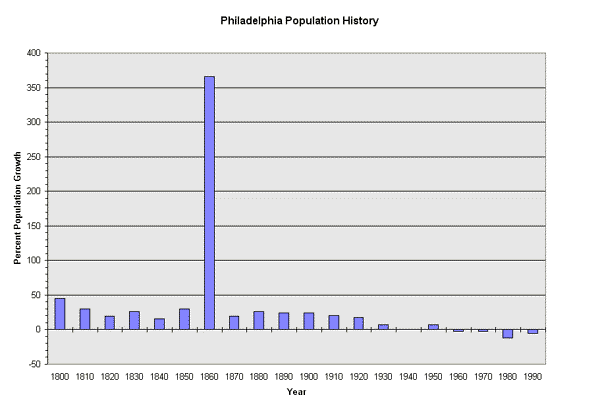
One significant event that negatively affected Philadelphia’s population was the Yellow Fever outbreak of 1793. Historians believe that the fever initially arrived at the shipping port docks, brought to Philadelphia on the ships owned by Stephen Girard from the Caribbean island of St. Domingue (Present day Hispaniola island of Haiti and the Dominican Republic). Another theory is that the outbreak was caused due to outhouse wells and sewers contaminating the local creeks. From the port and Olde City, the virus spread and killed approximately 10% of the population.

Some good did come from this tragic epidemic, however. Ben Latrobe and Frederick Graff established a municipal water system, now known as the Water Works in the Fairmount neighborhood. This water system provided clean drinking water to Olde City using gravity and slope, other concepts that students can explore in 8th grade mathematics. A possible reading from this event for students is “A narrative of the proceedings of the black people, during the late awful calamity in Philadelphia, in the year 1793: and a refutation of some censures thrown upon them in some late publications,” written by Absalom Jones and Richard Allen. Their account describes the heroic roles of African American men and women nurses who treated the predominantly white sick residents of the city, led by Dr. Benjamin Rush. Sam Katz, a local businessman and filmmaker created a documentary film series on Philadelphia. One of these films, titled Yellow Fever, could be used to supplement the reading. The image below is a primary source from 100 years ago that students can use to complete a Notice and Wonder activity.

Sample Notice and Wonder image using the “Influenza Deaths In U.S. Cities” graph
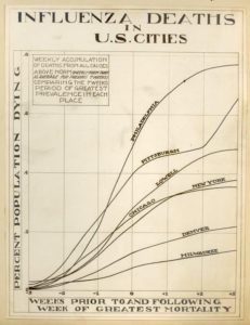
Source: NY Times

Later epidemics followed. By the 1800s Philadelphia was in the midst of the industrial revolution. Manufacturing and textile industries bolstered the economy and the city developed a strong economy. This led to the development of neighborhoods and to the birth of the row home. Other influxes of immigrants caused the population to increase, such as the Irish Potato famine in the 1840s. In the late 1800s, Chinese immigrants arrived, and the city continued to grow and diversify. The Spanish Influenza of 1918 struck Philadelphia fiercely as about 500,000 citizens contracted the flu over the next year, with over 15,000 deaths total; 12,000 died in just three months, September to November 1918 (Encyclopedia of Greater Philadelphia). Due to similarities with COVID-19, this might be a topic worth exploring with students and allowing them to compare and contrast the two events.

Population was influenced not only by diseases. Other notable population events include a steady influx of residents in the early 1900s. By the 1950s, when factory jobs dried up, several societal changes took place that caused a mass exodus of citizens in major cities. Women gained economic independence through national policies such as the Equal Pay Act of 1963, Title IX, Equal Credit Opportunity Act, and the Roe v Wade ruling. Women now controlled both their fertility and their vote. Birth control became legal, and gender roles changed as women increasingly joined the workforce.

As urban planner Daphne Spain mentioned in “What Happened to Gender Relations on the Way from Chicago to Los Angeles,” the urban space in American cities transformed from a modernist monocentric to postmodern polycentric metropolis. A boom of edge cities and new construction began. Families now needed two cars to get to work, and the Regional Rail train network was created for fast access to the city from suburbs on the “Main Line” in Ardmore and Bryn Mawr, about 10 miles away. Prior to 1940, fewer than 25% of women were in the workforce. In contrast, by 2001 more than 60% of all women were employed.

Spain also mentions important concepts worth discussing with students: that women went from unpaid to underpaid. To bring these gender disparities to light, students can learn about the Gender Wage Gap in social studies and apply math to determine how much money men earn on average compared to women. In a social studies classroom, data could be presented online graphs or bar diagrams that enable students to use percentages to make meaning from demographic information about race and gender disparities.

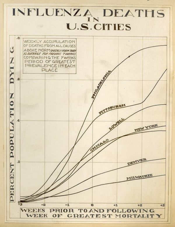
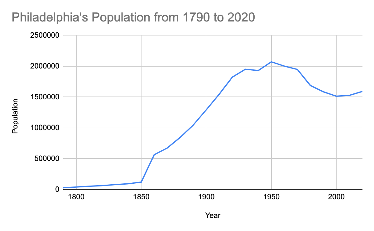
A 25% population decrease occurred over a period of 50 years from the 1950s-2000s. The population of Philadelphia fell from about 2 million inhabitants to about 1.5 million and family sizes shrank from about five children per household down to two. Although these are large numbers, a bar diagram can be shown to students so they can estimate the population change without using a calculator. We would like students to be less reliant on calculators and recommend the use of a bar diagram using 2 million as the whole (100%) population. Ideally students will explain that one quarter, or half of half, of the population left the city. There is a litany of essential questions that can be asked that have ramifications on the city noted in the lessons below.

Over the past 10 years, the city of Philadelphia has again seen a small increase in population with the help of tax-abatements for new construction and immigration. Certain communities are growing faster than others, and the demographics and ethnicities of the city continue to change. Philadelphia’s demographic breakdown is as follows: 44% African American, 36% Caucasian, 13% Latinx, and 7% Asian (US Census Bureau). Although the city appears to be diverse, it is a city largely segregated by neighborhoods. This is partially due to the ‘redlining’ tactic that occurred by denying services and mortgages to people of color in order to keep the neighborhoods segregated. A tool that could be used in the interdisciplinary classroom to study Philadelphia’s segregation is the citywide diversity index from the American Communities Project (ACP). Students can explore US Census Bureau data from the ACP and use census data to guide their understanding of urban diversity and segregation.

There is a plethora of resources below that can be used to find percent change in the form of graphs, images, charts, and visuals. The US Census Bureau has a wealth of raw data that has been visualized and is ready to use for Notice and Wonder activities. Ideally students will be able to have “voice and choice” with their assignments, hence the variety of resources for them to choose from. It is recommended teachers investigate the sources themselves prior to assigning them to students.

Problem Statement: Middle school 7th and 8th grade students are learning mathematics out of context with little connection to the real world. Mathematics is frequently taught in isolation from other subjects without connections or real-world applications. How can we apply mathematical concepts such as Notice and Wonder strategies to social studies lessons to deepen student’s understanding of both content areas?

Objectives

The learning objectives for the unit will be:

  • To examine a graph in order to determine population percent change
  • To understand and solve percent change problems
  • To analyze graphs to make sense of data and make inferences about social studies
  • To create context for mathematics in real-world settings
  • To model and interpret social phenomena using mathematical models
Goals
  • Increase mathematics achievement and proficiency on summative assessments for students in an urban setting
  • Apply concepts of 21st century education in real world settings
Essential Questions

There are innumerable questions to be asked, even about population statistics. However, as a starting point, understand that the essential questions seek to deepen the meaning of lessons by uniting concepts and skills under a broader understanding thus allowing for students to see the ways in which smaller ideas synthesize into universal concepts. These questions may be posed in the beginning of a lesson for thought as students learn, to assess their grapes of a lesson as an Exit Ticket, or as a springboard for further questions and discussion. This list of questions is not by any means exhaustive. For some questions, further discussion grows from branching out, as seen by the particular way the research can be approached. For example, the math teacher will likely ask analytical questions, while the social studies teacher will help students identify causes and implications of these changes. A table of essential questions is provided in the handouts.

Teaching Strategies

The strategies used in the typical math classroom use a gradual release model: direct instruction, guided practice, independent practice and a check for understanding such as an exit ticket. Although students love structure and routines (but might not admit it), I find it important to break the monotony of the math classroom by using a variety of instructional practices. For example, Notice and Wonder activities are an excellent way to get students talking about real-world phenomena, provide a safe space for thinking and sharing ideas, elicit information from them that they might otherwise not be willing to share. All too often our students are hesitant to take risks when problem solving, for fear of being made fun of or fear of being incorrect. My goal is to encourage students to make educated guesses, write down what they know and see, and ask questions that they will explore in order to make sense of the data they are seeing.

This unit will utilize several strategies to engage students and allow them to master skills in math: They will find value in their thinking and learning with graphic organizers, be able to choose their own assignments, participate in hands-on learning, connect math to other learning areas, and develop a vested interest in the answers they are solving for. To help us do this students will be collaborating in large and small group discussions and stations.

Classroom Activities

In order for students to find value in their thinking and learning, they will need to practice expressing their ideas in a low stress format. Students will complete I Notice, I Wonder activities about graphs of Philadelphia’s population over time. They will work individually and then share in small groups to look for commonalities. This will allow for independent thinking while demonstrating their ability to see trends and decipher graphs. Students need to have their voices heard; they should be provided choices within lessons. They will be given different scenarios and numbers for computational purposes as they develop their understanding of city statistics.

In order for students to participate in hands-on learning and connect math to other learning areas, they will need to participate in lessons that have them as an integral part of an equation that spreads across content areas. Students will calculate changes in population based on their own decisions and historical scenarios. In order for students to develop a vested interest in the answers they are solving for, they will take ownership over their city and connect its outcomes to the world around them. Students will analyze data, predict outcomes, and invest in plans that change those outcomes.

Notice and Wonder: Graphs of Philadelphia’s population over time

  • What do you Notice about the Graph? What do you wonder?
    • Sample student responses: Why is there a spike in the graph in 1850?
      • Why does the population increase slow down in 1860?
      • Why does the population start to shrink in 1930s?, but rise again in the 1940s?
      • Why does the population decline from 1950s – 2000s?

Calculating Percent Change

  • Using a bar diagram to represent percent change: Percent increase, Percent decrease
  • Using US Census Bureau raw data to determine percent change and/or percent growth
  • Applying knowledge of percent change to make sense of real-world phenomena

Graphing population change

  • Graph Philadelphia’s population change from the first census in 1790 to 2020
    • Sample task:
      • Compare major cities by graphing their data
      • Compare and contrast their percent changes using events: Ex. Spanish Flu
    • Sample Questions:
      • How do cities respond to historic events that cause fluctuations in population?
      • As industrialization increased, how did city growth respond?
      • What are the independent (ex. industrialization) and dependent variables (ex. growth)?

What’s Going On in This Graph?

The New York Times has a variety of graph activities which are perfect for a math Do Now in a social studies classroom. Students are able to understand the impact of the graph and build their confidence talking about math in a low-stakes environment using a Notice and Wonder activity. There are about 60 charts, maps and infographics that are organized by topic. They also host webinars and allow students to share their observations and questions with researchers from the American Statistical Association (ASA) in a discussion. Students are invited to create a “catchy headline” and share them, along with their analysis of the graphs.

Fishbowl Discussion

The fishbowl discussion is a technique used to get students talking in a low risk setting. It is student-centered and allows for the entire class to participate in a discussion, usually at the beginning of a topic, either by speaking in a small circle or taking notes and asking questions in an outer circle. Although frequently used in ELA classrooms, this is a fun way to engage students in a mathematics or social studies classroom as well.

Gallery Walks

This teaching strategy allows students to read and respond to the work of their classmates by writing or displaying their work vertically. Teachers are also able to see all of the student work and ask probing, justifying and clarifying questions as students discuss how to solve problems. This is a kinesthetic activity that requires only chart paper and markers for math.

3 Act Math Tasks

Dan Meyer’s activity can be applied across content areas. In the first act, students are provided with some information, usually in video form (ideally solving a real-world problem). They are then asked to discuss what they know and make predictions. The second act provides students with a little bit more information and allows them to work through the problem and try various strategies and methods. In the third act, the teacher reveals the answer with a classroom discussion.

The Five Themes of Geography

There are several concepts from geography that can be applied to both social studies and mathematics. The basic questions “where is it?”, why is it there?” and “what is the consequence of it being there” are an entry point for middle school students. Other possible discussion subtopics and sample questions are included below.

  • Location
    • Where are we located?
    • What can we use to determine where we are exactly located?
    • How does the importance of our location change over time?
  • Place
    • How would you describe where you physically live?
    • What natural resources are available where we live?
    • What human characteristics describe where we live?
    • What physical characteristics describe where we live?
  • Human / Environment Interaction
    • How do humans depend on their environment?
    • How do humans modify their environment to meet their needs?
  • Movement
    • What examples of movement of people do you see in your neighborhood or city?
    • How has immigration impacted our area?
    • What are methods of transportation in our area?
  • Regions
    • How do regions form and change?
    • How many regions can we identify in our area?
    • What physical characteristics describe regions?
Lessons

<td”>Exit Ticket<td”>How does population affect quality of life? Give 3 positives and 3 negatives.

Lesson 1:  Philadelphia’s Population
Essential Questions What do population statistics mean for our world? Why bother?

Why do populations in cities change over time?

Objective Students will examine a graph in order to determine population percent change.
CC Standards 7.RP.A.3   Use proportional relationships to solve multistep ratio and percent problems. Examples: simple interest, tax, markups and markdowns, gratuities and commissions, fees, percent increase and decrease, percent error
PA Standards CC.2.1.7.D.1 Analyze proportional relationships and use them to model and solve real-world and mathematical problems.
Materials Pencils, graph paper, calculator
Do now Notice and Wonder: Philadelphia’s Population Graph

What do you Notice about the Graph?

Students are welcome to complete the activity using a Google Form which I have created here as well and see all the results of other participants.

  • Anticipated student responses:
  • The graph increases significantly from 1850 to 1930
  • From 1950 until 2000 there is a decline in population
  • There is a slow increase in population from 1800 to 1850
  • There is little data/small population before 1800
  • What do you wonder?
  • Why does the graph suddenly increase?
  • What does this graph mean?
  • What causes these increases/decreases in population?
Lesson
  • Provide students with the population data provided below from the Census Bureau. The data is neatly typed here, the graph above is included. (Population data from other cities can be added to juxtapose the population growth).

Finding percent change using a bar diagram

  • Students will deduce the algorithm using bar diagram without using a calculator Percent change formula:
  • Ex. Population of Philadelphia in 1690 is 600 residents.
  • Math teacher
  • Model or have students create a bar diagram to represent 100% of the population (600).
  • Can students determine the population increase without using a calculator? Each time 600 more residents move to Philadelphia, the population increases 100%. By what percent does the population increase from 1690 to 1730 (from 600 to 12,000 residents)?
  • Social Studies Teacher
  • What factors contribute to the increase in population?
  • What are the effects of population increase on residents, the city, and the environment?
  • Algorithm Example New Population 41200 – Original population   28500 = 12700 change in population. 12700 difference divided by the original population of 28500 = 44.5% increase in population
  • Extension-  Have students calculate percent change from each decade using the Census Bureau Data.
  • Comprehension Questions:
  • Which year shows the greatest population change?
  • How does the graph look in those years?
  • Which year shows the least population change?
  • How does the graph look in those years?
  • As the population changes, how will it affect the city?
  • Use the graph to tell a story about Philadelphia’s population change in your own words. How many vocabulary words can you use?


Lesson 2: Philadelphia and Changes in Population

(this is before your in-depth math lesson, this is about seeing the reasons for studying, what makes the changes, and is the foot in the door for how they will start to make decisions about their city)

Essential Question Why do populations in cities change over time? What factors contribute to these changes?
Objective  Students will apply concepts of percent change in order to draw inferences about population change using historical data.
CC Standards 7.RP.A.3
PA Standards CC.2.1.7.D.1
Materials pencils, graph paper, calculator
Do now Begin with a notice and wonder activity.

  • Notice and Wonder: Philadelphia’s Population Graph
  • What do you Notice about the Graph?
  • What do you wonder?

Use student questions to guide the lesson

  • Sample student responses:
  • The graph jumps up a lot in 1860. What happened in 1860 that caused this change?
  • Which change is the greatest?
  • Why does the population drop after 1950?
Lesson Use the graph to answer the questions:

Why is there a spike in the graph in 1850?

Why does the population increase slowdown in 1860?

Why does the population start to shrink in 1930s?, but rise again in the 1940s?

Why does the population decline from 1950s – 2000s?

Allow students to research answers to their questions in pairs/small groups.

Ask students to share in small groups, and visualize their findings using chart paper

Conduct a gallery walk of each small group work as a whole class. Conclude with a whole group discussion.

Independent Practice You have a city now to manage. Describe the city using the My City worksheet. (Student Resource 1).

Maintain a City Ledger/ Log. The population is 100,000*.

Suggest two events (one that increases and one that decreases) the population by 10% over 1 year.

What is the population at the end of the year for both events?

Exit Ticket Why do populations in cities change over time?

What factors contribute to population change in Philadelphia?

Extra Credit: Children and young adults are using the term “OK Boomer” as an insult to Americans over the age of 60. What is a “boomer? Which decade does the term come from?


Lesson 3: Graphing My City’s Population Growth
Essential Question What factors contribute to the changes in populations?
Objective Students will apply percents in order to understand and solve percent change problems
CC Standards 7.RP.A.3
PA Standards CC.2.1.7.D.1
Materials  graph paper, pencil, erasers., color pencils
Do now Begin with a notice and wonder activity.

Notice and Wonder: Philadelphia’s Population Graph

What do you Notice about the Graph?

What do you wonder?

Anticipated student responses:

  • The graph goes up the most in 1860. What happened in 1860?
  • Why are the graph numbers in the negative after 1920? What does this represent?
  • Why are some years about the same, and others are way more or way less?
  • Optional- it is not necessary to show the labels on the graph, or the title necessarily when completing the Notice and Wonder activities. This can be revealed after the first round of questions and could be adapted to a 3 Act math task (as the 2nd act). The reveal (Act 3) would then jump into the answer and a mini-lesson.
Lesson Provide students the raw data, and ask them to find the percent population growth from year to year. It is possible for them to estimate on the graph first, and then find the percentages.

Have students research the causes for these incremental changes. (1860 should stand out as the largest increase in population).

Compare this graph to yesterday’s Notice and Wonder (showing percent increase in population vs percent growth)

Have students complete a Choice Board using Webb’s Depth of Knowledge to compare both graphs

Have students create a number line using (counting by decade) and visualize historical events causing fluctuations in population on the number line.

  • Group students randomly and have them pick/assign them a decade from 1790 to 2010 (or 2020).
  • Have them identify major historical events that caused the population to increase or decrease (wars, famine, plagues, etc.)
  • Students will determine population increase from the prior decade.
  • Allow students to make inferences and draw conclusions about their decade
  • Have students complete a gallery walk of the timeline.
Independent Practice Present scenarios and have students apply these to their cities and calculate the percent change to population once they choose the new population statistic based their starting population minus the losses:

  • Birth rates skyrocket when soldiers return from war.
  • A winning sports franchise leaves the city due to a buyout.
  • Two major tech companies build facilities nearby. One just outside the city limits and the other within the city limits.
  • Environmentalists and health officials discover that lead has been seeping into the city’s water supply for over a decade.
  • The Fugitive Slave Act passes in 1850.
  • A municipal law passes that legalizes gay marriage/gambling.
  • A building ordinance is overturned that allows for skyscrapers to be built.

Graph the changes over 10 years. Be prepared to explain the change. Present to a small group. Post in room/ Keep for future assignments.

Exit Ticket What factors contributed to the population change in your city?

Explain how and why they had an impact.


Lesson 4: Percent Population Growth
Essential Question How can we use percentages to analyze population growth?
Objective Students will solve problems using percent change in order to analyze population growth
CC Standards 7.RP.A.3
PA Standards CC.2.1.7.D.1
Materials pencil, paper, graph paper, color pencils, eraser, computer for research
Do now Begin with a notice and wonder activity.

Notice and Wonder: Philadelphia’s Population Graph

  • What do you Notice about the Graph?
  • What do you wonder?

Sample student responses:

  • I notice how the graphs both increase around the same time
  • Philly has a much larger population increase in 1860 compared to Cleveland
  • Both populations rise until 1940 and then decrease
  • Essential Question: Should we be comparing population increase or percent growth?


Lesson Display a population graph and review the population increases.

Apply the percentage increases in a scenario:

Example Scenario: Imagine that one day, we get at 25% increase of students in this classroom.

  • How many total students will we have in this classroom?
  • What issues might we have? (Lack of space, materials, heat)
  • What changes might we have to make? (Sharing desks; class is louder, etc.)

Apply another percentage that is higher. Continue to discuss (preferably in groups) how to respond. Students at this point are going to start talking about splitting the class into two groups/needing more rooms or working in the atrium, etc.

Add ideas or a twist to the scenario. Imagine we have a X% increase in this classroom (compared to a similar increase on a graph). The students are coming from another country and no one speaks English yet.

  • What happens when we run out of hand sanitizer/someone comes to school with the flu? Etc.
  • Create a pros/cons list of increasing population (be sure students are including pros like new cultures, more friends, etc.)
  • Go back to the graph of Philadelphia’s increasing population.
  • What types of problems will arise?
  • How will Philadelphia respond to it?
Independent Practice Using the data from Lesson 3, students find the percent population growth from year to year. It is possible for them to estimate on the graph first, and then find the percentages. Have students write an explanation for the changes. Explain how and why they had an impact.

  • Predict what happens due to population increase.
  • What will happen to healthcare in the city?
  • How will housing be affected?
  • How is daily life affected?
Exit Ticket What factors contributed to the population change in your city?

Why would the changes be positive and negative?

What factors could mitigate those changes?


Lesson 5: Impact of Population Growth
Essential Question What are the impacts of population growth on the environment?
Objective Students will use percents to find changes in population
CC Standards 7.RP.A.3
PA Standards CC.2.1.7.D.1
Materials pencil, paper, graph paper, color pencils, eraser, computer for research
Do now Notice and Wonder- choose a graph, chart, image or resource included below. Consider using What’s Going On in This Graph?
Lesson

Project

Create a choice board using all four of Webb’s DOK levels and provide students with an opportunity to choose tasks that will help them solve the essential questions.

DOK Level 1: Identify factors causing population change

DOK Level 2: Summarize how a population change impacts our city

DOK Level 3: Determine causes and effects for population change

DOK Level 4: Plan your own city and explain your layout model.

Small Group Practice Present the scenario: drought/ famine/ earthquakes/ tsunamis/ hurricanes ravage*s Europe/ Africa/ Asia/ South America. Immigrants flee to the US. Your city agrees to take 20,000 people the first month. 10,000 the second. And 5,000 the third. Students apply the percent equation to find changes in population. Students must be made aware that refugees span many demographics.
Exit Ticket Create a pros/cons list of increasing population.

*OPTIONAL: Students either get or create scenario cards with the natural disaster, country of immigrants and numbers (randomly generated) of refugees admitted in order to make their calculations.

Lesson 6: Visualizing Data
Essential Question What tools can we use to visualize population data?

Are some tools better than others? Why or why not?

Objective Students will be able to create and analyze graphs in order to make predictions and support historical conclusions.
CC Standards 7.RP.A.3
PA Standards CC.2.1.7.D.1
Materials pencils, graph paper, calculator, laptop/computer
Do now Begin with any notice and wonder activity using the Population Mountains visual story. Choose an image or allow students to provide one. Eventually they are able to facilitate the discussion lesson themselves and critique the reasoning of their classmates (SMP3).

  • Notice and Wonder: Philadelphia’s Population Graph
  • What do you Notice about the Graph?
  • What do you wonder?

Use one of the data or visualization resources below and allow students to explore the data, such as  Population Mountains infographic.

Lesson Allow students to choose their own tasks in the form of a Choice Board.  (Sample choice board rubrics are readily available online. Consider a student self-assessment or small group work rubric as well.

Task A

  • Ask students to read the visual story
  • Have students compare the population densities of American cities
  • Students can compare them to other cities around the world using the Human Terrain visual website.
  • Allow students to ask their own questions and answer them.
  • Provide small group support using a rotational model

Task B

  • Break students into groups and provide them with US Census data on a specific demographic (by wealth; by race; by education level; etc.) in the city of Philadelphia.
  • Have students make their own population mountain visual using a graph, map or chart of Philadelphia based on one demographic feature
  • Hang up student work around the room
  • Ask students to find patterns and generalizations
  • Have students infer causes for these patterns; predict effects of these patterns
  • Small group discussion on their findings
  • Assessment: small group self-assessment rubric

Task C

  • Ask students to look at the lines of best fit and allow them to make sense of the data at Pew Charitable Trust Report: The State of 10 Cities interactive website
  • Use the notice and wonder activity to allow them to ask questions, work collaboratively, and answer essential questions to make real-world connections.
  • Assessment: Provide students with an opportunity to set their own filters and create lines of best fit. Many statistics including data on homicides, poverty, median house-hold income, can be used to identify trends and societal consequences.
Independent Practice
  • Reflection in journals
  • Write to a local official about your findings (Ex. Mayor, City Hall Councilperson, State Representative, Senator, School Principal)
  • Create a postcard of a city. Within the letters of the city, illustrate and use key words that describe characteristics about the city.
  • Reader’s Theatre- have students write a script about statistical data.
  • Create a classroom newsletter using Census data, student classwork.
Exit Ticket Why does population data matter?


Bibliography

“Amid Coronavirus, America Needs a More Just Society” The New York Times: Opinion. 9 Apr. 2020. Online.

The series The America We Need is age appropriate for middle school students and provides articles on a myriad of topics that could be read in small groups across content areas.

Aristotle. Politics. Oxford: Clarendon Press, 1905. Print

This segment by the philosopher is about how to be a citizen in Ancient Greece and is apropos for our current national climate. Passages can be used across subject areas either in classroom meetings, reading excerpts, or even for conflict resolution.

Burgess, Ernest W. “The Growth of the City: An Introduction to a Research Project.”  The City  Reader (5th ed). Ed. R. LeGates and F. Stout. New York: Routledge, 2011. 161-169. Print.

Burgess was a sociologist at the University of Chicago, known for the concentric circle model for cities. Later researchers saw cities developing in a different model, for example see Daphne Spain below.

Calthorpe, Peter. 7 Principles for Building Better Cities. TED 2017. April, 2017. Web.

This TED Talk discusses novel ideas for expanding cities in the 21st century and beyond.

Davis, Kingsley. “The Urbanization of the Human Population.” The City Reader (5th ed). Ed. R. LeGates and F. Stout. New York: Routledge, 2011. 20-30. Print.

The cycle of modern urbanization is explained by Davis in terms of fluctuations in urban and rural populations. He mentions that the more underdeveloped a city is, the more quickly it can urbanize and grow. Additionally, he informs the reader that influx of manpower to cities is largely coming from rural counties as people moved to cities for employment.

Dubois, W.E.B. “The Philadelphia Negro”. The City Reader (5th ed). Ed. R. LeGates and F. Stout. New York: Routledge, 2011. 110-116. Print.

Dr. Dubois was the first African American to earn a doctorate at Harvard University. He was a political activist and professor at University of Pennsylvania. At that time, Philadelphia had the largest African American community in the northern United States.

Encyclopedia of Greater Philadelphia. 1 May, 2020. Online.

This website has a litany of resources available for teachers to use, such as maps, artifacts, and primary sources. An interactive historical outline can be used in the lesson plans provided. There are several “themes” that could be adapted for small group work and choice boards.

Howard, Ebenezer. “Garden Cities of To-morrow.” The City Reader (5th ed). Ed. R. LeGates and F. Stout. New York: Routledge, 2011. 324-335. Print.

This article provides a glimpse of rural and urban life in England at the turn of the 20th century.

International Labour Organization (ILO). Women and Men in the Informal Economy: A Statistical Picture, 3rd Ed. 2018. Online.

This is a great resource for teaching students about the global informal economy.

Lanchester, John. “The Case Against Civilization: did our hunter-gatherer ancestors have it better?” The New Yorker Magazine. 11 Sept. 2017. Online.

The article explains how we transitioned from to an agrarian society and its benefits and complications. It is a short read that is appropriate for a middle school setting and provides insight into how our current overreliance on grain began.

Mumford, Lewis. “What is a City?” The City Reader (5th ed). Ed. R. LeGates and F. Stout. New York: Routledge, 2011. 91-95. Print.

Lewis Mumford was a public intellectual, renowned social commentator, and urban historian. He describes ideal population sizes for cities, limitations on their sizes and density, and discusses the notion of mononucleated vs. polynucleated cities with more than one center.  Mumford also describes an “optimum area of expansion” before a city becomes too large for the benefit of its residents.

Plato. The Republic. New York: Books, Inc. 1943. Print.

Concepts and excerpts from the Republic can be read with middle school students if some context and support is provided. Why should philosophy be introduced in high school if students are able to relate to the concepts in middle school? I personally enjoy the Allegory of the Cave and concept of Philosopher Kings.

Protheroe, Nancy. What Does Good Math Instruction Look Like?” Principal, Vol.87(1). Alexandria, VA: Sept-Oct. 2007. 51-54. Print.

This article provides ideas and strategies for math instruction in the content areas, and would be useful if a teacher wanted to implement math across disciplines.

Spain, Daphne. “What Happened to Gender Relations on the Way from Chicago to Los Angeles?” The City Reader (5th ed). Ed. R. LeGates and F. Stout. New York: Routledge, 2011. 176-185. Print.

As mentioned above, Spain’s article sheds light on societal factors not taken into consideration by predominantly white male urban planners. Her article is appropriate for middle school readers and is apropos for the current political climate and push towards gender equality in the US.

Warner, Sam Bass. “Evolution and Transformation: The American Industrial Metropolis, 1840-1940.” The City Reader (5th ed). Ed. R. LeGates and F. Stout. New York: Routledge, 2011. 55-64. Print.

Worker’s rights, or the lack thereof, have come back into the limelight during the COVID-19 pandemic. Warner’s article points out the need for unions in order to secure basic working conditions and rights. It is worth reading in your classroom as it covers a century of population growth, and the effects on society as a result of this growth.

Zhang, Tingwei. “Chinese Cities in a Global Society.” The City Reader (5th ed). Ed. R. LeGates and F. Stout. New York: Routledge, 2011. 590-598. Print.

This article provides a look at urbanization in China- the world’s most populous country. There are diagrams that can be used to illustrate population growth in China, and can be read in the classroom. Zhang does a nice job of using math to explain urban migration to coastal cities brought on by economic reforms of the Communist Party.

Appendix

These links can be used to read about Philadelphia’s history, assign readings to students, explore graphs and data that has been visualized so students can see raw data in a new context. The US Census Bureau has a litany of resources that are all free and highly recommended and can be easily used as a Do Now or adapted to create a Productive Struggle problem worth solving such as a 3 Act math task.

Category Website URL
Philadelphia, PA History of Philadelphia  https://archive.usgs.gov/archive/sites/mcmcweb.er.usgs.gov/de_river_basin/phil/phil_data.html

Historical Society of Pennsylvania

https://hsp.org/blogs/fondly-pennsylvania/homefront-casualties-philadelphias-influenza-disaster

Global Philadelphia, World Heritage City

http://globalphiladelphia.org/


Visit Philly

https://www.visitphilly.com/history-in-philadelphia/

Philadelphia’s History (maps)

https://www.phillyhistory.org/PhotoArchive/Home.aspx

World Population Review: Philadelphia

https://worldpopulationreview.com/us-cities/philadelphia-pa-population

PA Historical and Museum Commission

http://www.phmc.state.pa.us/portal/communities/documents/1681-1776/index.html

Philadelphia Census Information

https://www.census.gov/quickfacts/philadelphiacitypennsylvania

Philadelphia’s Population Ranking

http://physics.bu.edu/~redner/projects/population/cities/philadelphia.html

Population of Philadelphia- by race

https://worldpopulationreview.com/us-cities/philadelphia-population/

National American Historical Association

https://www.historians.org/

American Communities Project

https://www.americancommunities.org/

Top 20 Cities Highest Ranking Cities, 1790 to 2010

https://www.census.gov/dataviz/visualizations/007/

Census Data Wheel

https://www.census.gov/library/visualizations/interactive/acs-datawheel.html

Census Interactive Data Map

https://www.census.gov/library/visualizations/interactive/acs-datamap.html

Numeric Population Change by Metropolitan/Micropolitan Statistical Area, 2010-2018

https://www.census.gov/library/visualizations/2019/comm/num-pop-change-metro-micro.html

US Bureau of Labor and Statistics: https://www.bls.gov/data/#maps

International Women in Informal Employment: Globalizing and Organizing

https://www.wiego.org/

Self Employed Women’s Association http://www.sewa.org/

Map Chart.net  https://mapchart.net/  (or HistoricalMapChart.net)

This map creation tool is a wonderful way to empower students to create maps and graph data in new ways. There are some distracting ads to be aware of, but this could be a great resource for older middle school or high school students who already have a solid grasp of geography and technology or GIS. This resource is a new way to visualize data on maps, such as demographic information, and students are able to select the specific factors they want to research. This would be a great tool for a Choice Board or research project. It is also a useful tool for classroom teachers who would like to create custom graphs. This is a type of Geographic Information System (GIS) that are multidimensional renditions of geography, visually appealing, and useful.

Resources for Teachers

The following websites provide teachers with historical data that can be used in a variety of ways. The US Census Bureau has a plethora of raw data that is neatly visualized in graphs, charts, and images. Hopefully this will help students gain new insights, make sense of large numbers, and use data to create a historical narrative in Philadelphia or elsewhere.


Category Website URL
Visualizing Data Data Visualization Library- Census Bureau

https://www.census.gov/library/visualizations.html

Visualizing city growths 3D map

https://commons.wikimedia.org/wiki/File:Largest_cities_in_the_United_States_by_population_by_decade_Visualization.png

Largest Cities spread visualization on a US Map

https://www.youtube.com/watch?v=BJ27NVX1C58

Census Story Maps and Visualizations

https://www.census.gov/library/visualizations.html

https://www.census.gov/dataviz/visualizations/021/

https://www.census.gov/data-tools/demo/race/MREAD_1790_2010.html https://storymaps.esri.com/stories/2014/census-county-population-change/

American Community Survey: Data Visualization

https://www.census.gov/newsroom/blogs/random-samplings/2018/07/the_american_communi.html

Pudding 3D visualization of population in the world

Human Terrain: Population in 3D

A Century of Population Change in the Age and Sex Composition of the Nation

https://www.census.gov/dataviz/visualizations/055/

By the Grid: Population Shift to the West and South

https://www.census.gov/dataviz/visualizations/024/

2016 American Community Survey Dashboard

https://www.census.gov/library/visualizations/interactive/acs-5year-datamap.html

American Statistical Association

https://www.amstat.org/

This is Statistics.org

https://thisisstatistics.org/

10 Trends that Have Changed Phila in 10 Years

https://www.pewtrusts.org/en/research-and-analysis/reports/2019/04/11/10-trends-that-have-changed-philadelphia-in-10-years

Predicting Philadelphia’s Future Population

https://www.opendatanetwork.com/entity/1600000US4260000/Philadelphia_PA/demographics.population.change?year=2018

Demography

https://www.suda.su.se/education/what-is-demography/demography-the-study-of-human-populations-1.20955

Cross-curricular

collaboration

NGSS https://www.nextgenscience.org/

C3 Framework https://www.socialstudies.org/standards/c3

Standards for Mathematical Practice http://www.corestandards.org/Math/Practice/

Edutopia article by Ben Johnson

https://www.edutopia.org/blog/cross-curricular-teaching-deeper-learning-ben-johnson

This article can be used as a reference during a common planning time.

Phenomenal Education

http://www.phenomenaleducation.info/change-with-digital.html

A holistic approach to education is popular in Finland. Students are encouraged to explore concepts and are not constrained by subjects. This allows students to take a different approach to learning, dive deeply into topics, and have lots of choice in what they are learning.

Standards

The following standards are suggestions that can be used across content areas for teaching data visualization. Other standards also apply, this is by no means an exhaustive list.

Math Standards ELA and Social Studies
CCSS 7.RP.A.3

Use proportional relationships to solve multistep ratio and percent problems. Examples: simple interest, tax, markups and markdowns, gratuities and commissions, fees, percent increase and decrease, percent error.

PA Core Mathematics Standards: CC.2.1.7.D.1

Analyze proportional relationships and use them to model and solve real-world and mathematical problems.


CCSS.ELA-LITERACY.RH.6-8.7

Integrate visual information (e.g., in charts, graphs, photographs, videos, or maps) with other information in print and digital texts.

CCSS.ELA-LITERACY.RH.6-8.1

Cite specific textual evidence to support analysis of primary and secondary sources.

CCSS.ELA-LITERACY.RH.6-8.2– Determine the central ideas or information of a primary or secondary source; provide an accurate summary of the source distinct from prior knowledge or opinions.

Handouts

What do you Notice about the Graph?

Data Source: US Census Bureau     Image created in Google Sheets

I notice I wonder


Predict why populations change over time and explain your reasoning:


Tell a story about the graph in your own words:


What do you Notice about the Graph?

Source: USGS Delaware River Basin Project


I notice


I wonder


Which years have the greatest increase in population percentage?  What causes this to happen?


Tell a story about the graph in your own words:


What do you Notice about the Graph?

Source: USGS Delaware River Basin Project


I notice


I wonder


Can you use this graph to predict a future population of Philadelphia? Explain why or why not.


Tell a story about the graph in your own words:


What do you Notice about the Graph?

Source: Schroders

I notice


I wonder


What is similar and different about population change in both Philadelphia and Cleveland?


Why don’t all the lines representing each city begin at the point of origin on the graph?


Essential Questions Broad Exploration Topic Specific Exploration Topic
Why do (city) populations change over time?
How do changes in city populations connect to changes in rural populations?
How do changes in populations alter belief systems?
Who has power and who does not within a population?
What determines this? How and why does it change over time?
What factors contribute to the changes in populations (in Philadelphia, cities)? Rate of change Birth & death rates

Migration

Demographics

Industry

Disease, famine

How quickly is the change occurring? (Allowing students to examine change through percents) By event type (requires categorization before calculation can be made)

By year

By decade

By century

By millennium

What is the impact of population change on a city? Tax implications Revenue

Construction

Funding for education systems based on property values

Housing


Gentrification

Red lining

Supply

Rents as a percentage of income

Education


Evolution of schools (one room; officially segregated; private, public, charter)

School choice

Overcrowded schools, Vouchers

Social implications Traffic

City services

Public transit

Sense of community

Access to healthcare

Drug use/trafficking

Private businesses

Development of political parties

Environmental City, Regional, National, Global

Resource depletion

Density Disease, Pollution
When does it make sense to study population growth and what can we learn from it? Example: The first United States Census was taken in 1790, and Philadelphia’s had about 44,000 residents. Read the four choices below then answer the question. How would you design a study of population growth? Why would you design it that way? Explain advantages or constraints for each way to study population growth: A. From year to year?  (Sample answer: You can estimate the growth from year to year using the Census data, but that would take a really long time to find data for hundreds of years!)

B. From 1790 to 1800  (Sample answer: You can see the growth over a period of time until the next census data is released. 10 years is not a long time though)

C. From 1790 to 1900 (Sample answer: 100 years is a long time, that’s a lot of people coming and going)

D. From 1790 to 2000+ (Sample answer: 200 years is a lot of data how can a percent be >100%?