The Information Age has dramatically transformed how we communicate on a daily basis with the help of internet, social media, and creative publishing platforms such as YouTube. Thus, storytelling is becoming an essential skill for displaying information and communicating effectively to the masses. This curriculum unit, Designing Data on Diabetes, takes 10th grade students on a journey in chemistry class to apply data visualization techniques in communicating scientific data. Students will learn about the prevalence of diabetes, the measurements used to diagnose the disease, and how data visualization plays an important role in predicted the prevalence of diabetes and tracking blood sugar levels in daily living. The unit should last about 7-9 instructional days and can be taught in conjunction with lessons on SI measurements, unit conversions, and significant figures. Assessments designed in this curriculum will performance-based criteria defined by the International Baccalaureate Middle Years Program.
The next generation of students are swimming in a sea called the Information Age. Our educational system definitely exposes students to a lot of information, but the delivery still lies in the traditional roots of reading, writing, and arithmetic. Those three components have driven educational practices, but the visual literacy, which invites students to interpret visual representations, is less emphasized. Since we now live in an information age where the answer to our questions are literally in the palm of our hands through mobile devices, a mental shift that embraces a multidisciplinary approach to education is necessary to work this dimension of teaching and move beyond simply creating visual activities. This unit will attempt to accomplish two things. First, provide students meaningful engagement in the classroom and with the subject matter (medical science in this case). Secondly, this unit will enrich students’ abilities to synthesize, model, interpret, and analyze data. Design Principles for Graphing Scientific Data While enrolled in the seminar, the difficulty in designing this unit arose from the chemistry curriculum itself. I thought I would write a unit focused on periodicity. It seemed perfect at first, but I thought applying the concepts of data visualization to periodicity to be mundane, traditional, safe, and probably overdone. The chemistry topic lacked context that students would find relevant. Therefore, I realized that I needed to create a moment for introducing data visualization, and I came to the conclusion of teaching the concepts within the concept of scientific measurements. One thing that I noticed in my students is their lack of imagination when it comes to creating graphs, especially by hand. I often get questions related to how often to place tick marks on the y-axis, numerical scaling the y-axis, and even color-coding the data. I believe it is because they do not have a firm foundation on what do people actually look for when they see a graph. Yes, they are taught how to graph in their math classes, but they do not seem to understand why we make graphs at all. Thus, this unit is a solution to that problem. The application of mathematics, including graphing visual data, looks different depending on your profession. Therefore, I believe that it is my responsibility as a science teacher to show students that graphing visual data has an important role in presenting data from scientific works. I personally did not learn of the nuances of graphing data until I took a chemistry course in quantitative analysis. In this class, I learned how to prepare professional reports with respect to both writing to data visualization. In addition, I accrued more knowledge of data visualization as I accepted appointments to internships, specifically at Rice University, where I attended a workshop on creating effective posters and presentations. I still refer to their online resources every time I prepare to present at a conference.1 At end of it all, enrollment in the data visualization seminar has helped me figure out how to take those personal and professional experiences, and transfer them to my students. Since the IB Diploma Program requires that students learn some of basics of organizing and presenting data in the form of a research paper, I think it would be great to equip my students with the design principles for graphing scientific data.
Student Audience The unit is intended for students in grade 10, who attend classes together as an advisory or homeroom. Students have 60-minute class periods three days per week and 50-minute class periods twice weekly. An estimated 90% of the students are enrolled in algebra II, while the remaining students take geometry. The students enrolled in geometry are usually in the same homeroom, which hastens the pace of the class compared to sections without geometry students. Grade 10 students are also committed to the completion of a personal project as a requirement for finishing the International Baccalaureate (IB) Middle Years Program (MYP). Roughly 85% of the student population is African American. One-third of students are from the neighborhood, while the remainder come from around the city of Philadelphia. Key and Related Concepts In IB MYP, key concepts are words used to paint a broad picture of learning expectations that can be observed within and across disciplines. There are three fundamental key concepts that IB recommended in science: change, relationships, and systems. Of the three fundamental key concepts recommended by IB, this unit will focus on the key concept of relationships. Related concepts are more discipline-specific and allow for exploration of the key concepts in greater detail to cultivate students’ conceptual understanding. There are 12 additional key concepts recommended for teaching chemistry content. The two related concepts selected for this unit’s presentation are measurements and patterns. Conceptual Phrase The conceptual phrase is a generic statement that summarizes a concept, is nonspecific, and can be applied across multiple content areas and topics. The conceptual phrase developed for this unit is as follows: Relationships between measurements produce patterns. This conceptual phrase can be translated to topics, such as periodicity, thermodynamics, or reaction kinetics. Thus, students benefit from learning conceptual phrases because they potentially build continuity between old and new content. Inquiry Questions Inquiry questions are provided for students as a guide to their learning expectations. They are not necessarily exam questions, but they ought to provoke students into learning the content. Below are the several examples of inquiry questions that can be used throughout the unit. Global Context The IB program insists that subjects are taught within a context. This unit will address the global context of scientific and technical innovation. Students will study humans use their understanding of scientific principles to make measurements and draw conclusions from the data. Specifically, students will focus on the application of measurements used in chemistry to track blood sugar levels for diabetic patients. Inquiry Statement The inquiry statement marries the conceptual phrase to the global context. It ultimately summarizes the unit in a way that students know the goals and expectations. Unlike the conceptual phrase, the inquiry statement is unique and specific to the unit, by which the statement may contain language specific to the course and/or content. Thus, the suggested inquiry statement for this unit is as follows: Relationships between measurements produce patterns allowing scientists to predict the onset of diabetes. Some key objectives of the unit will include the following: ● Identify and use SI units in measurements and calculations ● Set up conversion factors and use them in calculations. ● Distinguish between accuracy and precision in measurements. ● Apply scientific knowledge and understanding to solve problems set in familiar and unfamiliar situations ● Analyze and evaluate information to make scientifically supported judgments. ● Explain how to manipulate the variables, and explain how data will be collected ● Present collected and transformed data ● Interpret data and explain results using scientific reasoning ● Evaluate the validity of a hypothesis based on the outcome of the scientific investigation ● Explain the ways in which science is applied and used to address a specific problem or issue
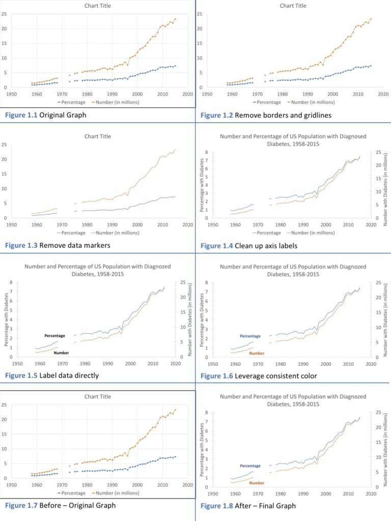
What is clutter? According to Storytelling with Data, there are cognitive load. Clutter is simply a visual element that takes up space, but does not build or enhance comprehension. Clutter primarily makes visual materials look more complicated than they really appear. Gestalt principles of visual perception The principle of similarity states that objects that have similar attributes such as a color, shape, size, and orientation, are perceived as belonging to a group. For example, if a graph has red and black points, there is an assumption made in our brains that all of the red points are related to each other and the black are related to one another as well. The enclosure principle states that anything physically enclosed in a shape belongs to a group. This is typically accomplished via shading or drawing shapes around points on a graph. The purpose of an enclosure is to draw attention to specific data. Gerrymandering is a common form of using enclosures to manipulate election results. The closure principle says that people like things to be simple enough that they already fit in preconceived constructs and visuals in our minds. When this happens, our brains will automatically fill in missing components in a visual construct. The Connection principle reveals that objects that are physically connected are part of a group. It stands out a little more than enclosure. More information can be communicated using the connection principle. For example, using a thicker line between data points rather than a thinner line can actually emphasize strength of the data or its importance. 6 Steps to Declutter Visual Data The following are 6 steps recommended to declutter visual data as mentioned in Storytelling with Data. Refer to Figure 1 for examples of how the 6 steps are implemented sequentially. 1. Removing chart borders 2. Removing gridlines 3. Removing data markers 4. Clean up axis labels 5. Label data directly 6. Leverage consistent color Diabetes Information Diabetes mellitus is a chronic condition that occurs when glucose cannot be effectively removed from the blood. The removal is impaired by the body’s inability to either produce or use insulin, which is a hormone produced by the pancreas glands that allow for glucose to exit the bloodstream into a cell for its conversion to energy. There are three many types of diabetes, type 1, type 2, and gestational. Diagnosing diabetes has not always been easy, but its observable diagnosis has been accepted has having raised levels of glucose in the blood.
The Core Curriculum of the school District of Philadelphia is aligned to the Pennsylvania Department of Education Standards Aligned System. The standards include instruction on the following topics: chemistry, physics, and environmental science. This unit will also align with the Common Core and Next Generation Science Standards.
Classroom Environment My classroom and lab are fully integrated. There are 8 lab stations for student placement. Seats are assigned for instructional groups consisting of four students. Due to the number of students seated at each station, it is only natural that they will be talkative. Therefore, I try to give the students opportunities to engage in conversation every 10-12 minutes whenever my lessons include lectures during direct instruction. Otherwise, I encourage my students to work in groups all the time. Compare and Contrast using Models I will begin the unit by going through the scientific method in the context of diabetes. I will use data from the eighth edition of the Diabetes Atlas, published by the International Diabetes Federation. Lately, their website contains media and resources in various formats including PDF copies, PowerPoint presentations, fact sheets, reports, and spreadsheets of data. In the context of scientific method, the plan is to show students the data from the atlas and allow them to identify variables, generate hypotheses, and analyze trends from the data. Inquiry Questions A common instructional strategy is questioning techniques. While it is common to pose questions orally in a classroom, the IB program encourages the use of inquiry questions with the intent of providing a roadmap or study guide of the unit to the students. Ultimately, by providing the students with a truncated version of the unit, the inquiry questions give the students a sense of what they will ultimately be assessed on. Factual Questions ● What is matter? How can we measure properties of matter? ● What is a derived unit? ● What are the rules for determining significant figures? Conceptual Questions ● How can we determine the nature of a substance? ● What are some examples derived units? ● What is the difference between density and concentration? ● How do significant figures in measurements affect our calculations? ● What are the benefits of using SI units? ● How does color affect one’s ability to understand visual data? Debatable Questions ● Has our ability to measure things more precisely changed our ideas about the material world? Assessment Opportunities ● Criterion C: Processing and evaluating
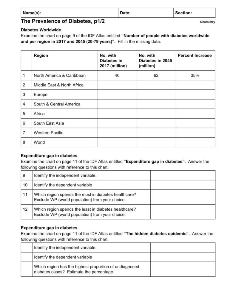
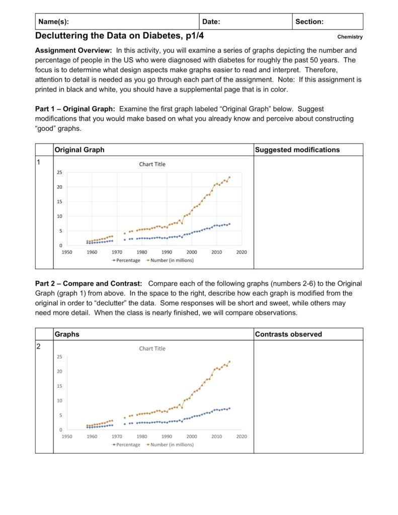
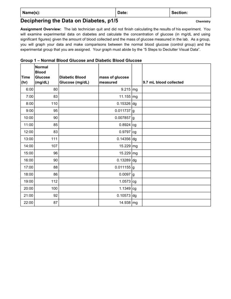
Below, you will see a suggested timeline of topics and activities. Activities marked with an asterisk (*) are ones developed with focus on developing and assessing skills in data visualization. The first activity, The Prevalence of Diabetes, focuses on reconnecting students with the scientific method, identifying variables, and drawing conclusions from data. By showing them examples of data from atlas, it will allow me to show students that data visualization, the art of expressing information in graphical formats, is a professional skill that has place in the real world. Students will receive a short lecture about the scientific method and diabetes. Then they will engage in a gallery walk, analyzing graphs from pages printed from the International Diabetes Federation Atlas. The second activity, Decluttering the Data, is where some data visualization skills will be taught. Students will be shown various formats of graphs and they will be asked to identify 6 major flaws that can be fixed or adjusted to make graphs more visually appealing and to ease their readability and interpretation based on the Gestalt principles. After establishing the context for two days, the plan is to teach the general chemistry topics. You may teach these topics as you see fit for your group of students. The final activity, Deciphering the Data on Diabetes, is a type of summative assessment that requires students to work in teams. Each group will be assigned a patient of varying blood sugar levels throughout the day. However, the blood sugar levels will be in the incorrect units for analysis. Students will convert the data to the correct units, using significant figures in their calculations. Then they will graph the data and apply the techniques of data visualization from the second activity. Draw conclusions from the data, having compared different experimental groups. Overview The first activity is designed to show students why measurements are important and to acclimate them to how useful measurements are. While these measurements do not focus on the implementation of SI units, students can still practice their analytical skills. The activity will best function in the form of a gallery walk or jigsaw groups. This activity was developed using data from the 8th Edition of the IDF Diabetes Atlas.[1] Since the IDF publishes this data regularly, this activity readily lends itself to future editions with minimal changes. Preparation To prepare, I suggest having specific pages printed in color and laminated or placed inside of plastic page protectors. The Executive Summary beginning on page 8 of the atlas provides a general snapshot of diabetes across the globe including how much money is spent in the healthcare industry and the proportion of deaths and undiagnosed cases. Chapter 4 of the atlas summarizes the prevalence of diabetes by region (pages 68-81). Sample of Assignment A sample from the first page of the activity is found below. Please refer to the appendix for the complete activity, including any additional supplement pages. Overview The second activity is to enlighten the students on the design aspects that go into creating visuals based on the Gestalt principles. Students will be required to examine a raw graph of percentage and number of people in the United States diagnosed with diabetes over roughly the past 50 years. During part one of the activity, students will suggest changes that they would make to improve the visual readability and interpretation of the graph. During Part 2, students will examine five (5) additional graphs and compare them to the raw graph. Each of the five additional graphs have been specifically modified to emphasize a technique used to declutter the data in the graph, or make the graph more visually appealing for reading and interpretation. The answers to should be reviewed as a class to make sure all the students have the correct terminology. For this activity, I have used the Gestalt principles to combine the first two steps to decluttering visual data because they both involve the removal of lines, reducing the number of steps to 5 5 Steps to Declutter Visual Data In Part 3, students will answer analysis questions with the intent of. Finally, Part 4 will require for students to examine a finished revision of the first graph with each suggested modification implemented. Students will be asked to reflect on the types of modifications and decide whether or not the modifications were useful decluttering the graph. Finally, given a set of numerical data, students will be asked to predict numerical values of percentage and number of people diagnosed with diabetes for an additional 5 years. Preparation If students are working without electronic devices, the assignment should be printed on paper and the supplement pages should be printed in color, and protected by either lamination or sheet protectors. It is necessary that students have a color copy of the graphs to examine even if the activity pages are printed in black and white. The supplement could also be distributed electronically. If the activity is completed electronically, such as on Google Classroom, then the supplement pages are not necessary. Sample of Assignment A sample from the first page of the activity is found below. Please refer to the appendix for the complete activity, including any additional supplement pages. Overview This activity can be considered a summative assessment for the unit. Students will be required to transform data into the correct unit of measurement for blood glucose (tissue glucose in one case) for humans and mice. The first three scenarios are based on real experimental glucose levels in diabetic blood, tissue, and pregnant women.[1] The last two scenarios are the effects of cocoa extracts on diabetic rats.[2] Each experimental group is compared to a control group. In the activity, students with human subjects are given data for the control group over about a 20-hour window of glucose monitoring. Students assigned to the two rat groups are given the data for a control group and a diabetic group over 4 hours. However, the data for all experimental groups is incomplete. All of the measurements are in different units and must be converted to the unit of concentration for blood glucose (mg/dL) in order to compare the data. Once students successfully transform the data, they are to graph the data and summarize the results, comparing and contrasting the data between their control and experimental groups. Upon creating the assignment, I only changed the amount of blood drawn between the two rat groups, therefore, the two groups assigned to the rats should actually get the same results after successfully converting all of their measurements. Preparation To prepare for this assignment, it’s best to just simply become familiar with the data and the graphs that students need to produce. Make sure that students have copies of the rubric so that they can refer to it and incorporate the design aspect of creating graphs in addition to performing conversions and preserving the significant digits. Sample of Assignment A sample from the first page of the activity is found below. Please refer to the appendix for the complete activity, including any additional supplement pages. Example Questions for the Students [For appendices please see PDF attached above]
Classroom Activity 1: The Prevalence of Diabetes

Classroom Activity 2: Decluttering the Data on Diabetes

Classroom Activity 3: Deciphering the Data on Diabetes

Amin, I, HA Faizul, R Azli – Nutrition & Food Science, and undefined 2004. “Effect of Cocoa Powder Extract on Plasma Glucose Levels in Hyperglycaemic Rats.” Emeraldinsight.Com. Accessed August 5, 2018. https://www.emeraldinsight.com/doi/abs/10.1108/00346650410536737. Federation, International Diabetes. “IDF Diabetes Atlas, 8th Edn.” Brussels, Belgium, 2017. http://www.diabetesatlas.org. Freckmann, Guido, Sven Hagenlocher, Annette Baumstark, Nina Jendrike, Ralph C. Gillen, Katja Rössner, and Cornelia Haug. “Continuous Glucose Profiles in Healthy Subjects under Everyday Life Conditions and after Different Meals.” Journal of Diabetes Science and Technology 1, no. 5 (September 24, 2007): 695–703. https://doi.org/10.1177/193229680700100513. Knaflic, Cole Nussbaumer. Storytelling with Data : A Data Visualization Guide for Business Professionals, n.d. Schierenbeck, Fanny, Anders Franco-Cereceda, and Jan Liska. “Accuracy of 2 Different Continuous Glucose Monitoring Systems in Patients Undergoing Cardiac Surgery.” Journal of Diabetes Science and Technology 11, no. 1 (January 9, 2017): 108–16. https://doi.org/10.1177/1932296816651632.